
August 5, 2026
Insights
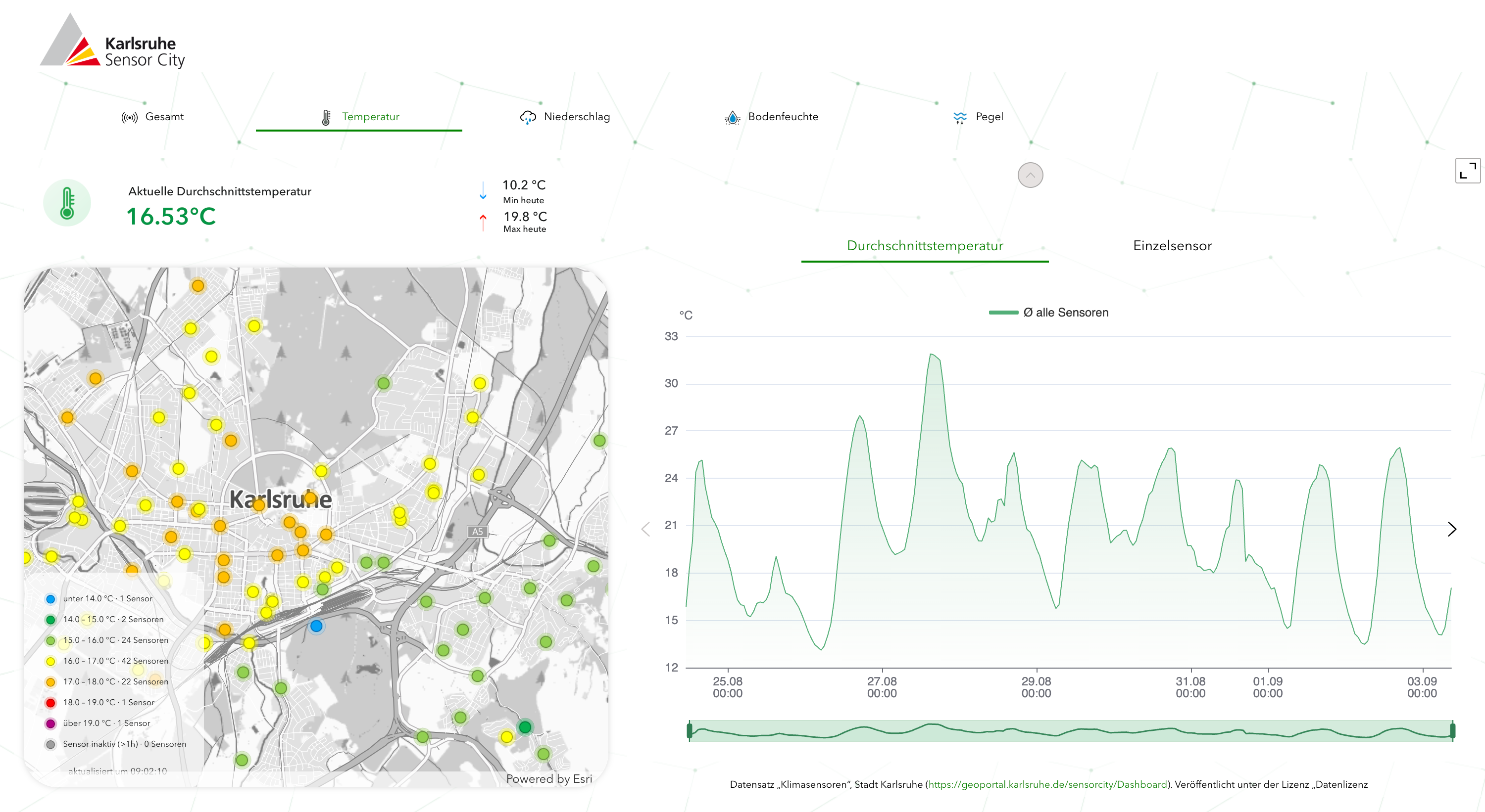
Karlsruhe is one of the warmest cities in Germany. Today, anyone can check exactly how warm: the city has installed close to a hundred climate sensors across every district, recording temperature, humidity and solar radiation about every ten minutes. An interactive map shows where the city is warmer and where it is cooler right now. Select a single sensor and you can compare its last ten days against the whole city.
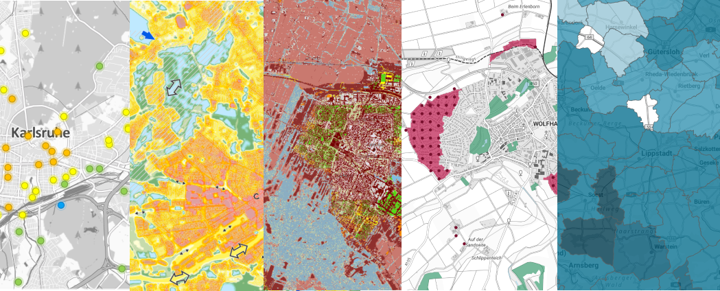
Karlsruhe is not unique in collecting this data. Cities and municipalities across Europe are calculating climate indicators from an increasing amount of data and publishing them as maps and dashboards to make them accessible. Some of those indicators are the basis for decisions about where to plant, where to make surfaces more permeable, where to build. Others are published, looked at, and that is where it ends.
Over the past year we, at Plan4Better, have been working on one of them. The Stadtklimadashboard brings together central climate adaptation indicators for German cities in one web application, built in GOAT by Plan4Better together with the IÖR, LUP and the Universität Kassel, commissioned by the BMWSB and the BBSR. Building it kept raising a question I could not answer from the inside: what separates an indicator that ends up in a decision from one that ends up on a screen?
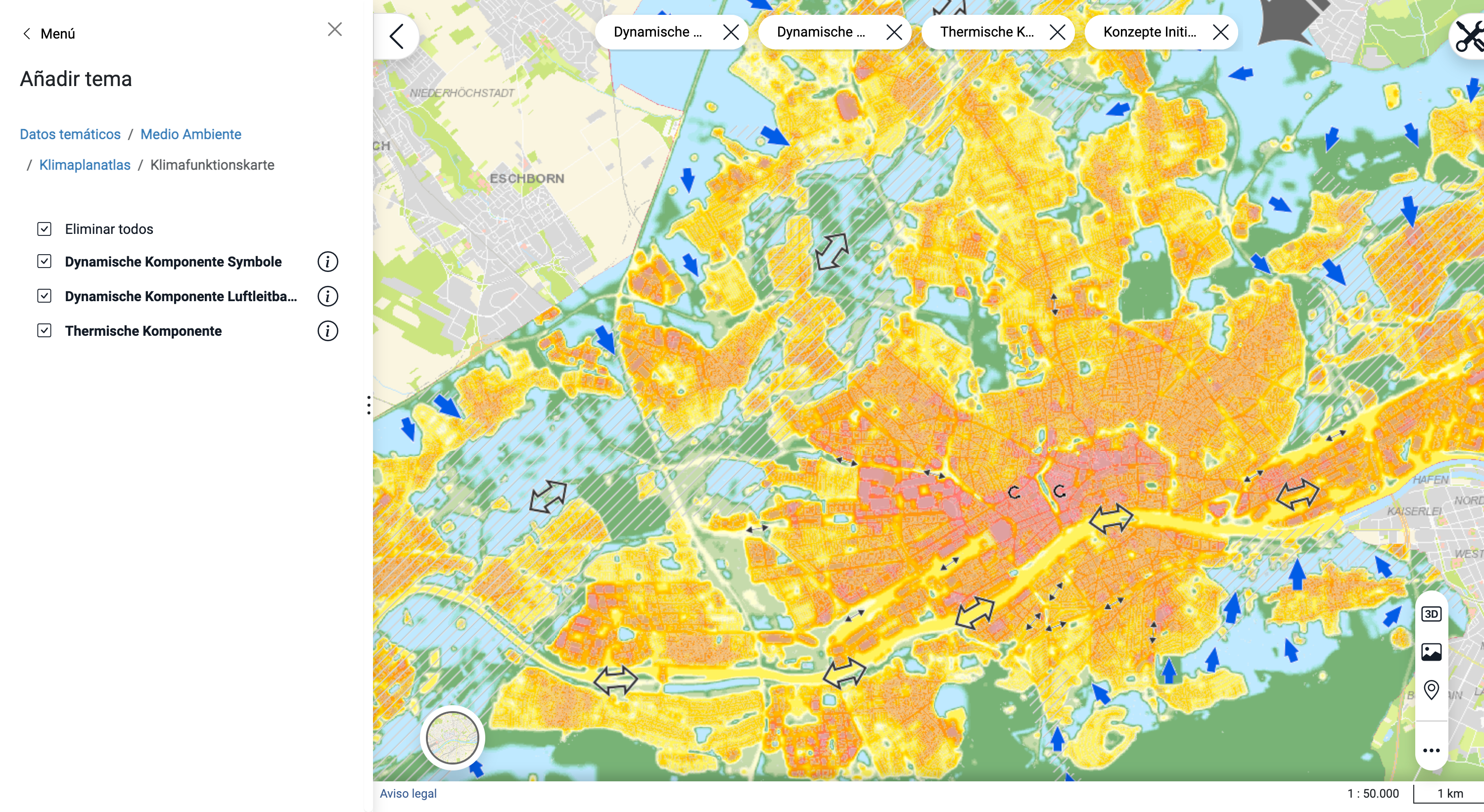
Start with what a city publishes. Frankfurt's Klimaplanatlas shows the urban climate in an interactive map: heat islands, fresh air flows and more, published as an up-to-date data basis for climate-adapted urban development. Which is exactly what it says, a basis. Whether it becomes a decision depends on what happens after someone opens it.
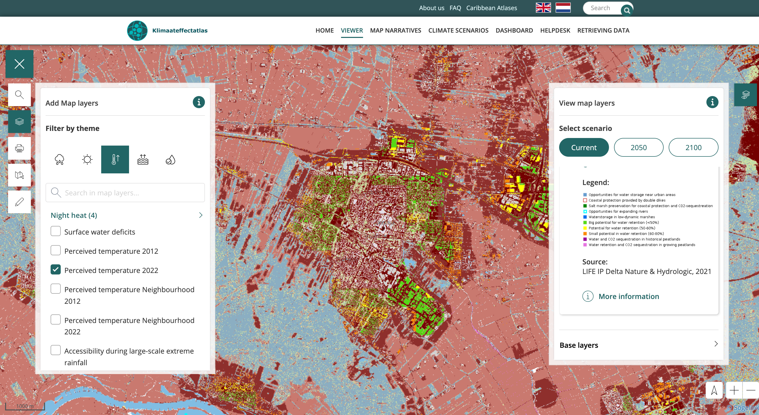
The Netherlands is the strongest test case available, because there the map is compulsory. Under the Deltaplan Ruimtelijke Adaptatie (Delta Plan for Spatial Adaptation) every municipality had to carry out climate stress tests for flooding, heat, drought and inundation, using the national Klimaateffectatlas, which gives a first impression of how vulnerable an area is to each of the four. The results do not stop at the map. Once a municipality has its stress test it enters a risk dialogue with the water authority, the province and Rijkswaterstaat, and from that dialogue comes an implementation agenda. The second round of stress tests, dialogues and agendas started in 2025.
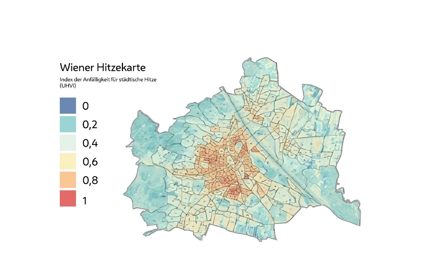
A bit more to the east, in the summer of 2020, Vienna set up eighteen temporary Coole Straßen (Cool Streets) and rebuilt four more permanently as Coole Straßen Plus (Cool Streets Plus), with shade, water elements and cooler surfaces. The locations were selected on the basis of the Wiener Hitzekarte, in coordination with the districts. That map does not only show where it is the warmest. It combines surface heat with where there is least green space and where the most children and older people live, and on that basis it identifies ten Hitzegebiete, mainly in Favoriten, Ottakring, Landstraße and Margareten, home to around 47,000 of the people most affected by heat. The Vienna result was not a live dashboard, it was a map answering one question: which streets, this summer, in these districts. The indicator was built for a decision that was already going to be taken.
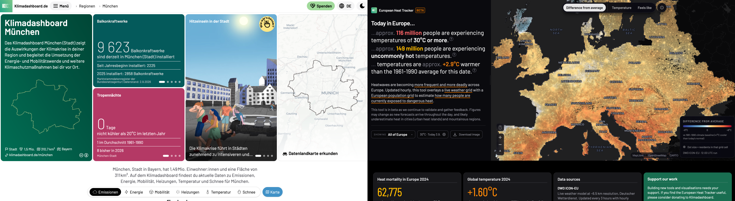
One of the most prolific producers of climate indicators and dashboards in the German-speaking region is not a government. Klimadashboard is a non-profit association publishing their results, code, and data openly. They describe their work as translating data and facts from recognised institutions into formats anyone can understand, so that discourse and decisions can be based on them. Yes, not only decisions, but also discourse. Unlike the indicators before, which were made to feed a specific planning decision, these are made for a general public, and they are widely used by media, schools, universities and public authorities.
One of their German regional application offers a dashboard for every municipality and district, showing local emissions, observed climate change and the contribution to the energy transition. Their European Heat Tracker, launched during London Climate Week 2026, combines weather data with a population grid to show how many people are affected by extreme heat in Europe right now.
In all of the previous examples, somebody had to choose: which of the things you could measure is the one worth measuring, what counts as good enough and what counts as a deficit, whose data the answer rests on, and what the map should make impossible to miss. Those choices are not visible in the result.
The frame around the work is federal. The Deutsche Anpassungsstrategie an den Klimawandel (Germany's Strategy for Adapting to Climate Change) sets the strategic framework for precautions against climate impacts, and heat, drought and heavy rainfall are becoming steadily more of a problem in German cities. Within that, the federal government is developing adaptation indicators aimed at urban heat prevention and a more natural water balance. The Stadtklimadashboard is the dashboard that came out of one of those projects.
Two core indicators sit at the centre. The methods behind them come from the consortium, and the layers they run on come out of remote sensing: the sealing and vegetation data are derived from satellite imagery by the colleagues who do that work, LUP among them. What Plan4Better built is the application those results arrive in, and the decisions about how they are shown.
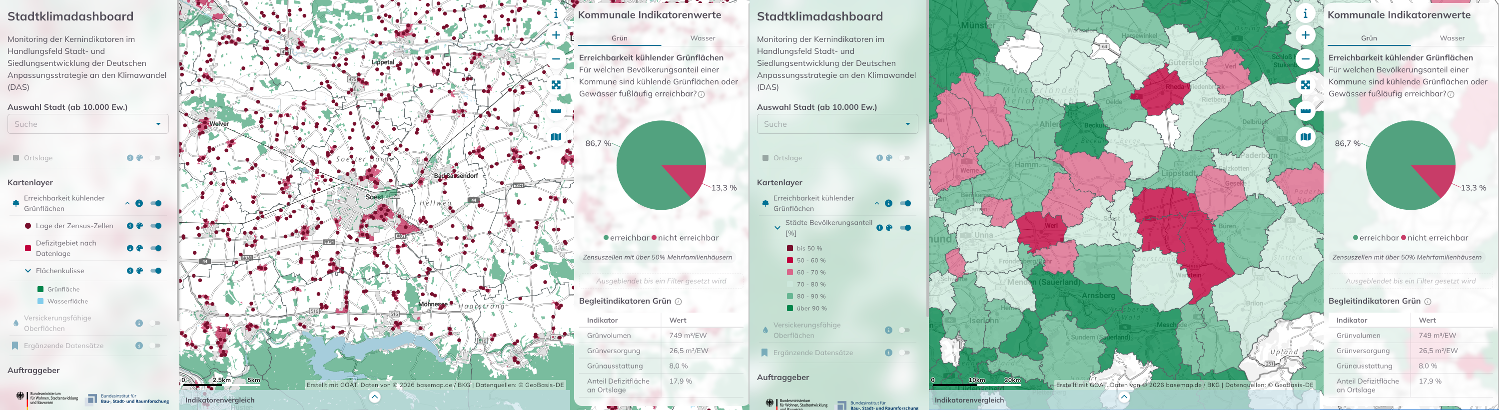
The first is the accessibility of cooling green spaces. It describes how well a population is supplied with cooling green and water areas within walking distance, and it is built to show up the deficits. That is a decision about what to put on the map. We could have coloured the areas that are well supplied, and plenty of green space maps do. Instead the layer that stands out is the deficit: the areas where the nearest cooling green or water space is more than 500 meters away on foot. What a planner sees first is the part of the city that fails the threshold. Not every green area counts. A space only qualifies as cooling if it is green or blue enough to do the job, which is decided from land use data and satellite-derived tree canopy. The indicator value for a city is the share of residents who can reach one within 500 meters.
What a planner sees first is the part of the city that fails the threshold.
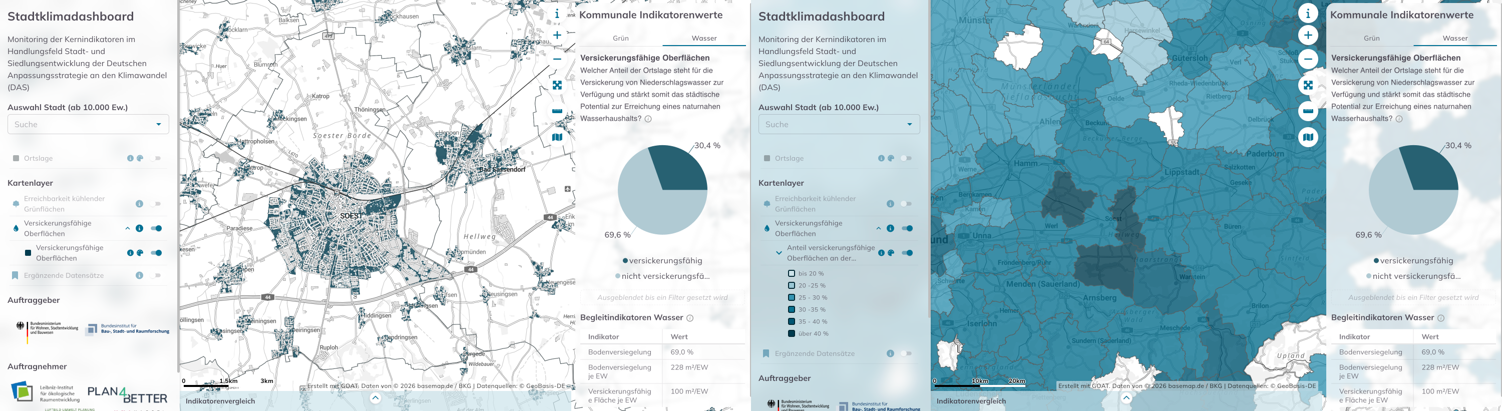
The second is infiltration-capable surfaces: the share of permeable or only lightly unpermeable ground inside the settlement area, as a measure of a city's potential for a natural water balance. Every 10 meter pixel inside the ATKIS settlement boundary is judged against a single threshold. Up to 30 percent soil sealing counts as infiltration-capable, which in practice means gardens, parks, brownfield land and lightly surfaced paths, all of which contribute to groundwater recharge. Above 30 percent, water runs off.
Alongside those, the dashboard carries green volume, canopy cover, further indicators on urban green, and a heat exposure index that combines land surface temperature, sealing, green volume and canopy through a principal component analysis.
None of that was settled at a desk. Several workshops were held with the IÖR, the rest of the consortium and municipal planners, where participants were given the dashboard to explore and asked what they made of it. The feedback we were looking for was not only about the interface and the visualisation. It was about the data and the indicators themselves. A lot of it came back as corrections: this is wrong, there is data missing here, that is a park and it is not showing as one, this area is full of greenery even though none of it is accessible. Those objections went back into how the indicators were defined.
This is wrong. There is data missing here. That is a park and it is not showing as one.
.webp)
The indicators are being tried out with the municipalities that would have to plan with them, and what comes back from that can improve them. But both are to be calculated regularly for every German city above 10,000 inhabitants, which means a municipality does not have to commission anything to see where it stands.
Across these examples the indicators end up in very different places. Karlsruhe's feed a framework plan that gets weighed in the Bauleitplanung. The Dutch stress tests run into a risk dialogue and then an implementation agenda. Vienna's heat map ended in eighteen streets for one summer. Klimadashboard's end up in a newspaper article or a classroom. The Stadtklimadashboard's will be recalculated for every German city above 10,000 inhabitants. What decides where an indicator ends up is mostly why it was made in the first place.
Underneath they are all doing the same thing, though. They compare. Where is it better, where is something missing, and where exactly.
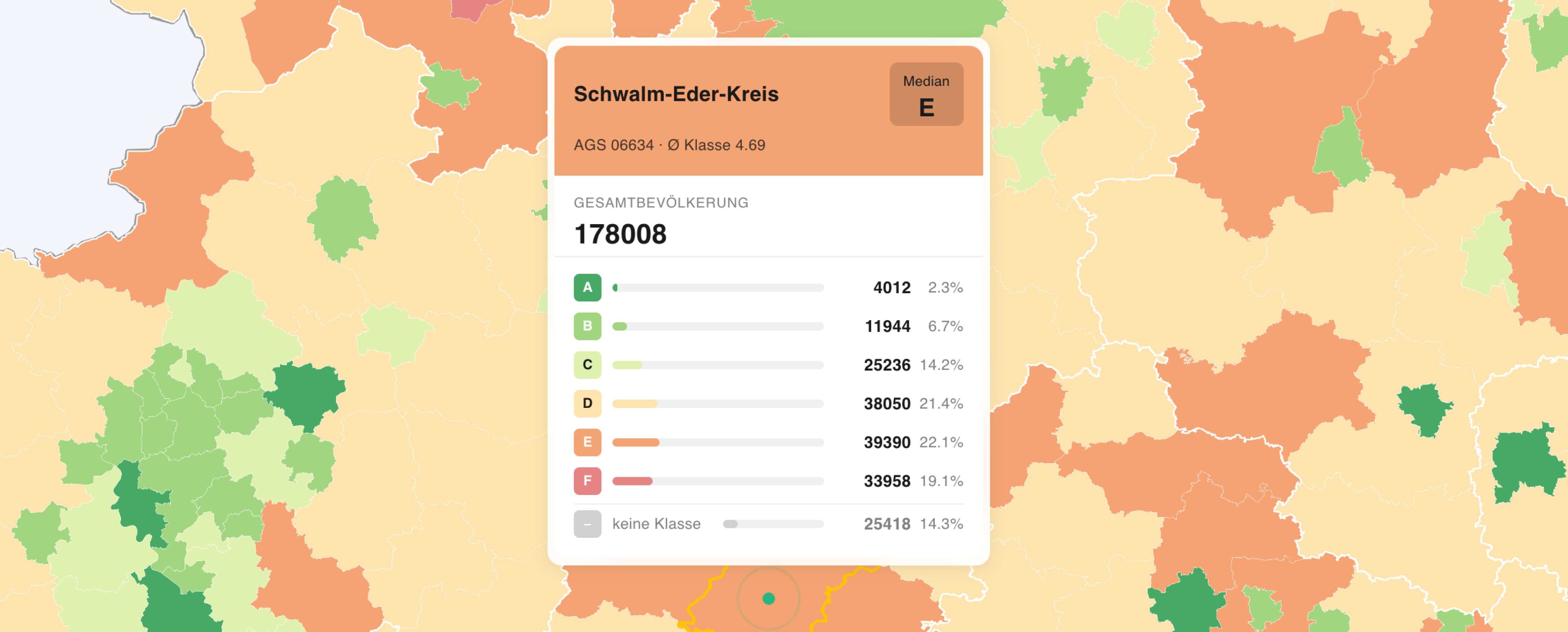
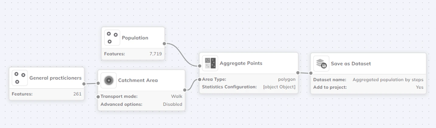
If you want to try building one, GOAT has a free trial: use the indicators that are already there, run them on your own city, and finish by putting the result in a map dashboard you can share. Two ideas to start from, both in our map gallery: accessibility to doctors, or kindergarten accessibility in Berlin, which combines distance with capacity using the Heatmap 2SFCA. If you want to know more about the Stadklimadashboard project you can take a look at the dashboard.
What are climate indicators?
Climate indicators are measurable values that describe how a place is affected by climate change, or how well it is prepared for it. In municipal practice they usually combine climate data with spatial and population data, for example the share of residents who can reach a cooling green or water area within a short walk, the share of surfaces that can absorb rainwater, or measured air temperature across a city. Their purpose is to make a general problem specific enough to act on, by pointing at a particular neighbourhood rather than at the city as a whole.
What is the difference between a climate indicator and a climate dashboard?
The indicator is the value and the method behind it. The dashboard is one way of publishing it. The same indicator can appear in an interactive web map, in a printed report for a council session, or in a spreadsheet used by a single department. Cities increasingly publish dashboards, but a dashboard only supports a decision if the indicator inside it is defined in a way that points to an action.
Which European cities publish climate indicators as maps or dashboards?
More and more of them, and the examples here are only a few. Frankfurt am Main publishes the Klimaplanatlas, an interactive map covering urban climate, heat islands and fresh air flows. Karlsruhe runs a network of around a hundred municipal climate sensors with a public live map. In the Netherlands every municipality works with the national Klimaateffectatlas, and Vienna used its Hitzekarte to select cooling measures. Beyond individual cities, the non-profit Klimadashboard association publishes regional dashboards for every German municipality and district, and the Stadtklimadashboard brings climate adaptation indicators together for German cities in one application. New ones appear regularly, at city, regional and national level, so any list of them dates quickly.
Are climate indicators actually used for planning decisions?
Sometimes, and the conditions are fairly consistent. Where an indicator is tied to an existing planning instrument or a specific decision, it gets used: Karlsruhe's adaptation framework plan is taken into account in the weighing of interests in the Bauleitplanung, Dutch stress test results feed a risk dialogue and then an implementation agenda, and Vienna selected its Coole Straßen locations on the basis of its heat map. Where an indicator is published without a route into a decision, it is harder to say what it changed.
What is the Stadtklimadashboard?
The Stadtklimadashboard is a WebGIS application that brings together central climate adaptation indicators for German cities. Its two core indicators are the accessibility of cooling green spaces, the share of a city's population that can reach a cooling green or water area within a 500 metre walk along the real path network, and infiltration-capable surfaces, the share of ground inside the settlement area sealed by no more than 30 percent. Both are to be calculated regularly for every German city above 10,000 inhabitants. The dashboard also carries green volume, canopy cover, further indicators on urban green, and a heat exposure index.
How is the accessibility of cooling green spaces calculated?
Not by straight-line distance and not by address routing. Distances are accumulated outwards from qualifying green and water areas along every route a pedestrian could use, on a 10 metre raster, so they follow the real path network. Census cells whose centre lies more than 500 metres from a cooling area are marked as deficit areas. The indicator value for a city is the share of residents inside the 500 metre threshold.
Can a municipality get these indicators for its own area?
Yes. Municipalities and consultancies can build and publish their own indicators in GOAT. Get in touch with us if you have questions about how to start, or if you feel brave enough, try GOAT for free.
Insights
GOAT
.png)
Development