July 14, 2026
GOAT
This November, the Plan4Better team took on the #30DayMapChallenge—not as solo cartographers, but as a collective. Why? Because 30 maps in 30 days is a lot for one person (we tried last year, trust us). But as a team? It became an opportunity to experiment, collaborate, and push the boundaries of what we can do with and without GOAT, our open-source planning tool.
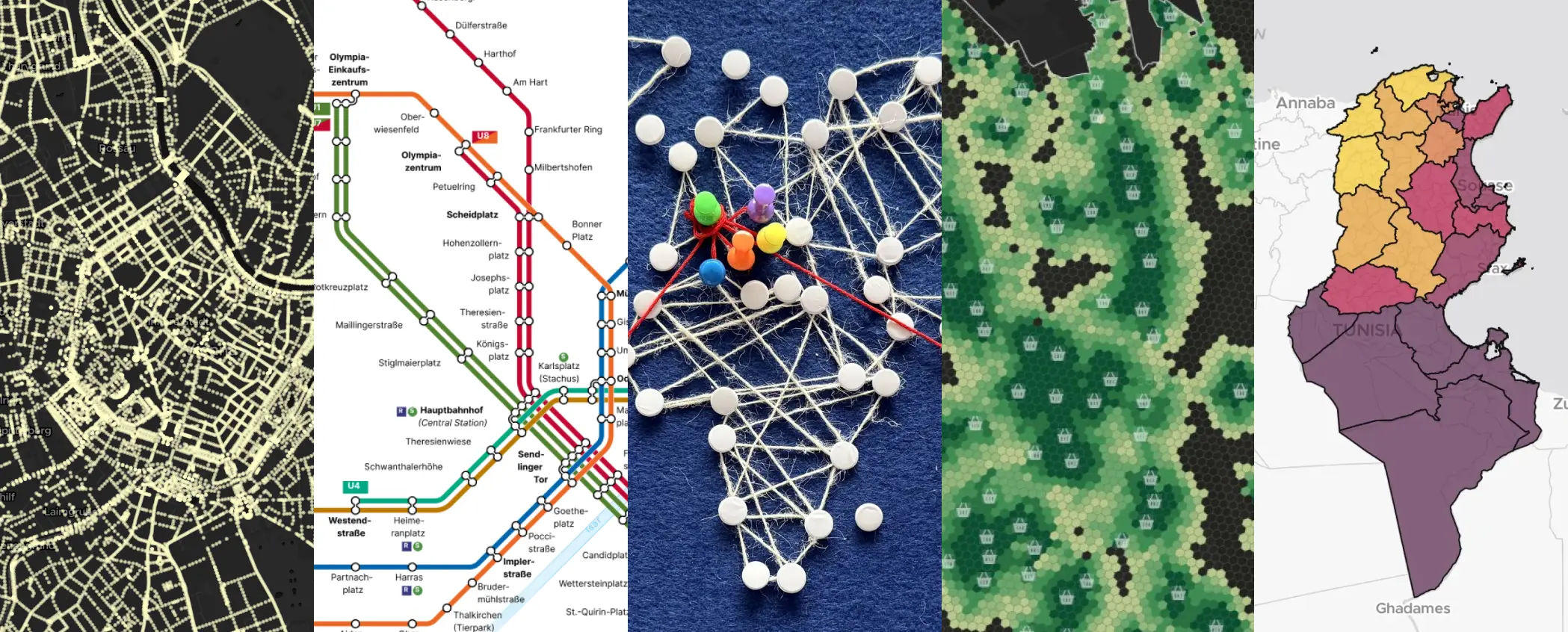
From streetlights in Vienna to Saharan dust plumes over Tunisia, from colorblind-friendly subway maps to analog string art, we turned data into stories. Here’s how we did it, and what we learned along the way.
We didn’t just make maps—we told stories. Here’s a peek at the highlights of each map:
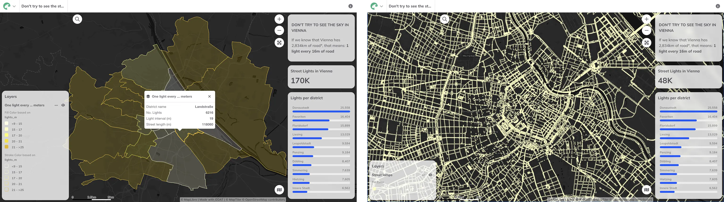
Camila’s streetlight density map started with a late-night run. Too many lights, she thought. So she dug into Vienna’s open data and found:
But here’s the twist: Coming from Buenos Aires, where light = safety, she wondered: Does more light always mean safer streets? Or does it just mean… more light pollution?
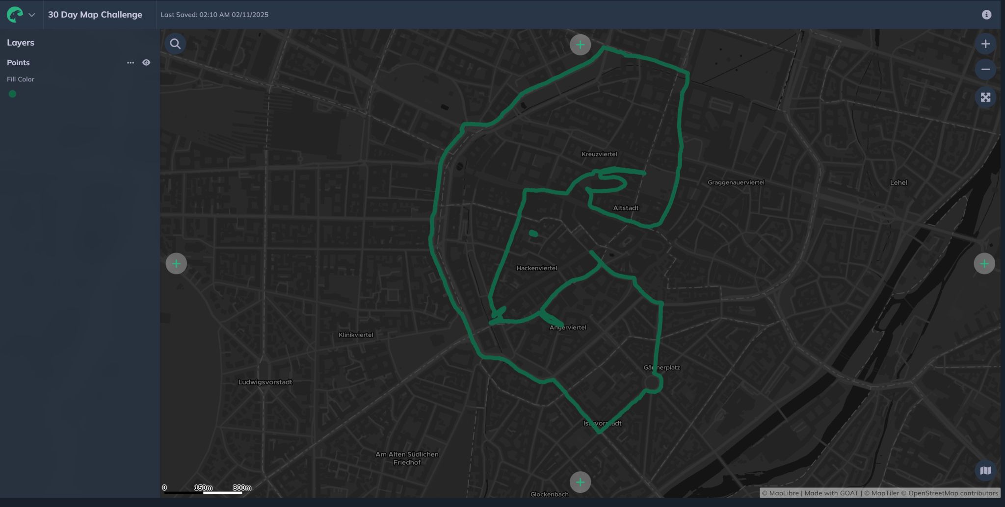
Drawn along Munich’s bike and walking paths, Gokul conducted a small experiment exploring the space between active mobility and urban form. He traced a (very urban) GOAT to ask: ‘How can movement—or a simple walk through Munich—become a drawing?’
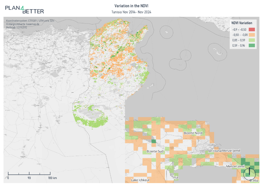
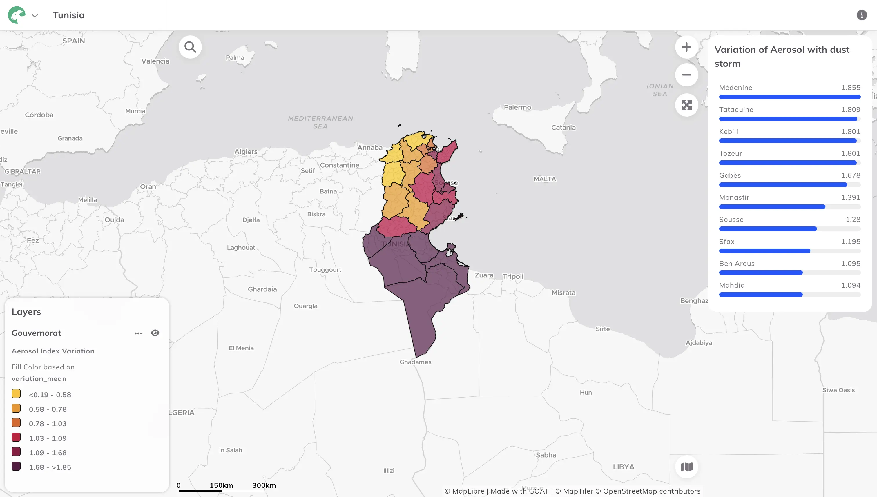
Cyrine used the #30DayMapChallenge to explore climate patterns in Tunisia—her home country—through the lens of earth, air, fire, and water. With Sentinel and Copernicus satellite data, she analyzed:


Munich’s subway map is iconic, but not for everyone. Noemi reworked the color palette to make it deuteranopia-friendly (that’s green-blindness, for those unfamiliar).
Why it matters:

For World Urbanism Day, Noemi built an interactive dashboard of Munich’s building heights. Fun fact: The Olympiaturm is the tallest—but how many levels does it have? (We’ll let you guess.)

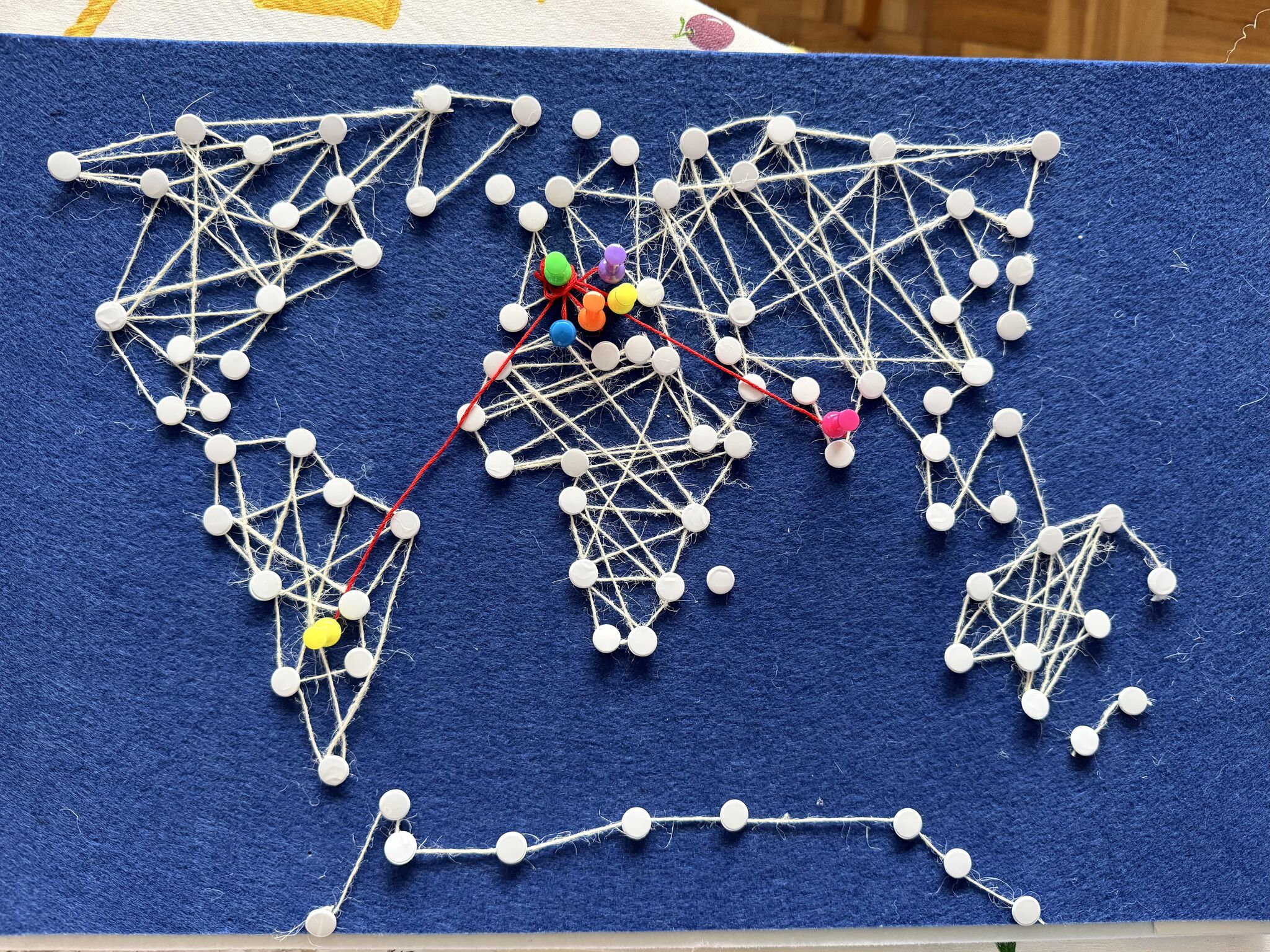
New to the team, Marta swapped pixels for pins and created a string art map tracing our team’s journeys to Munich.
The idea:
A reminder that our best work comes from mixing global perspectives with local action.
How little ink do we need to recognize a place? Noemi mapped three cities and a district using only greenery and water bodies, filling them with hatched lines. Is it enough to recognise them? You can check the step by step on the post.

A minimalist map of Munich using the street network from OSM, a clean form of the city, made entirely with GOAT.

What would you do if you used GOAT for the first time? Of course, what Marta did: map all of Munich’s restaurants, but highlight the Italian ones🍕.

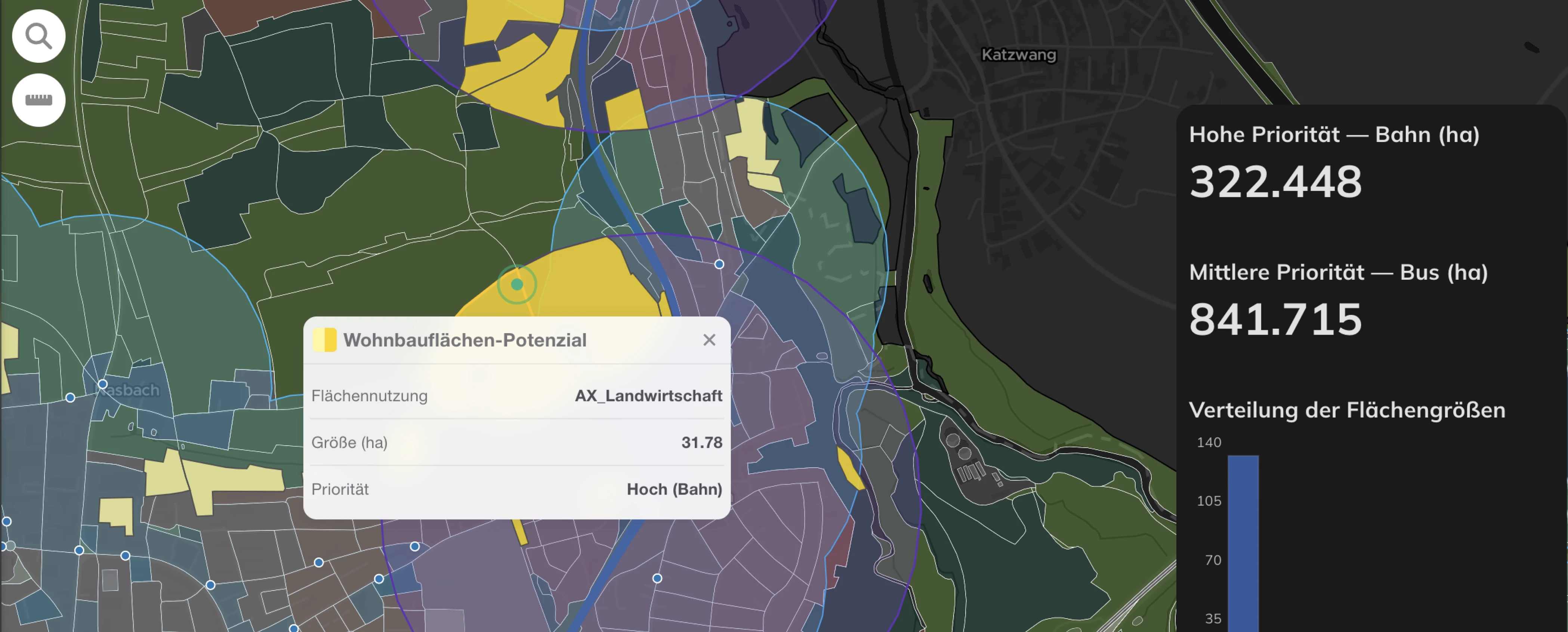
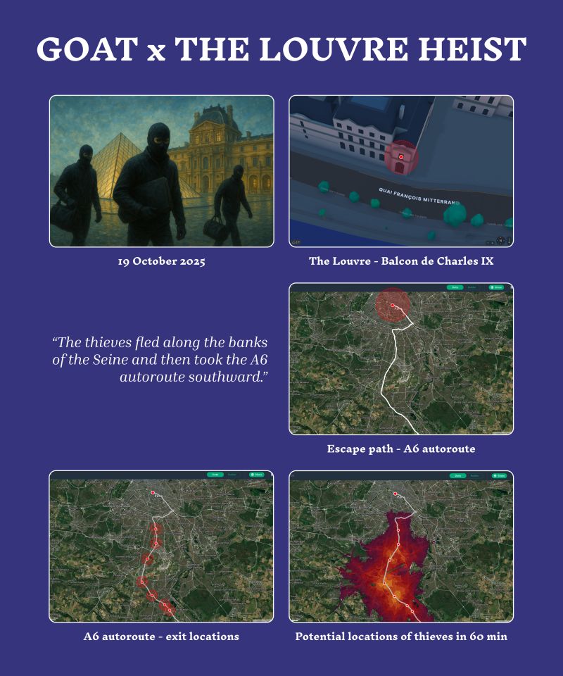
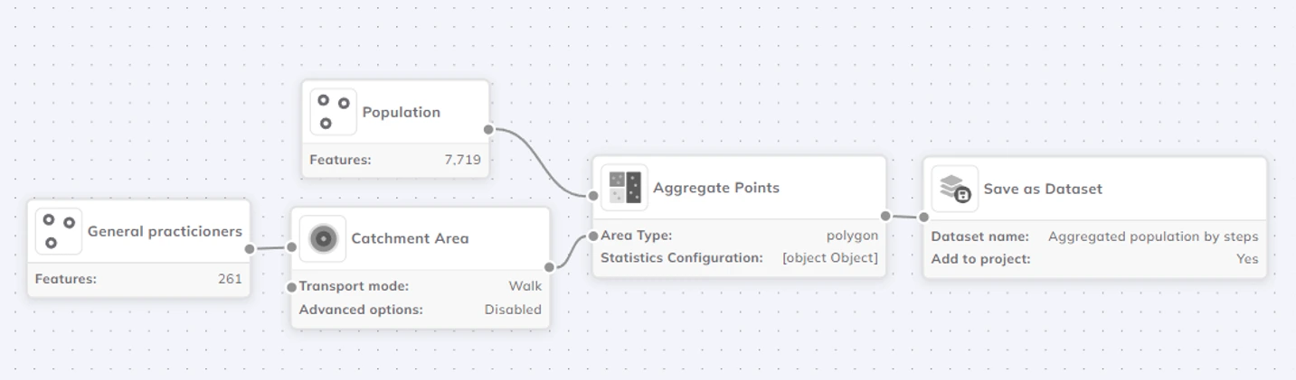
We had thought of many different use cases for GOAT, but using it to solve a case was the idea of Nihar. In his words: "Starting from Balkon de Charles IX, they fled along the Seine before taking the A6 autoroute southward from Paris.This multi-catchment area predicts their potential locations ~60 mins after the heist, originating from exits along the autoroute."
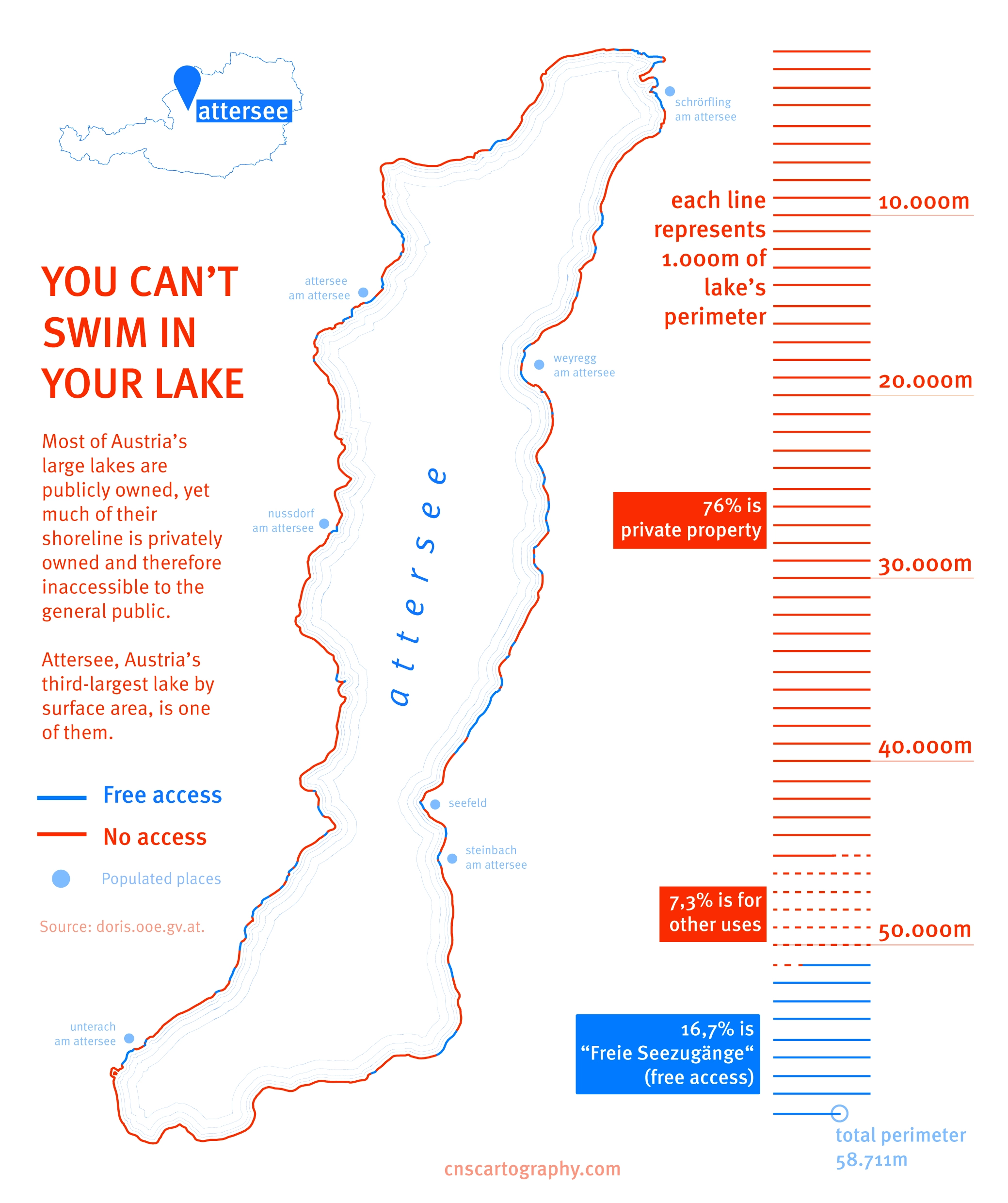
Austrian lakes are public, but their shores? Often private. Camila’s map exposed the pocket beaches, tiny public strips sandwiched between roads and private gardens.
The bigger question: Countries like Sweden and Argentina have Jedermannsrecht ("freedom to roam"). So why doesn’t Austria?
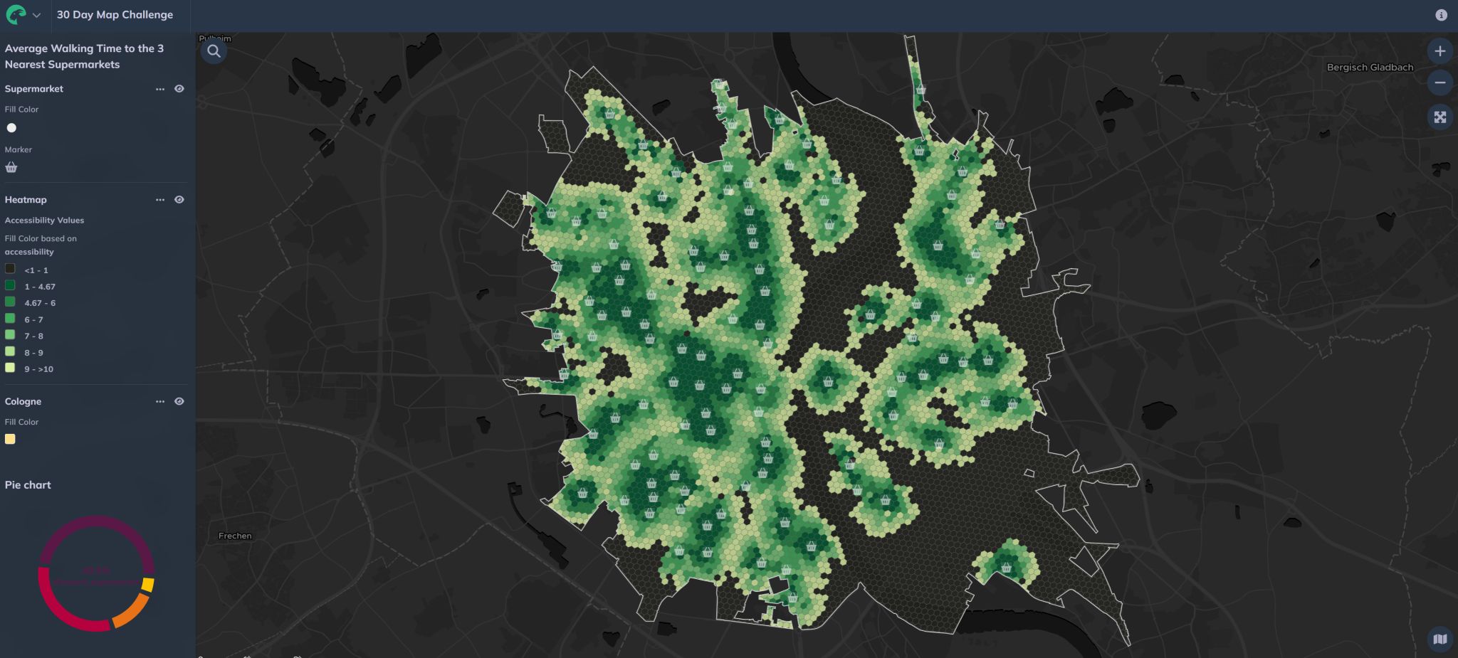
Using the Closest Average Indicator from GOAT, Gokul mapped the accessibility to supermarkets considering the three nearest supermarkets reachable within a 10-minute walk in Cologne.
Key insight:
The #30DayMapChallenge is over, but the experiments aren’t. Here’s what we’re taking forward:
Inspired? Here’s how to run your own team map challenge:
If you want to use GOAT, you can sign up for a 14-day trial here.
GOAT
.png)
Development
.jpg)
.jpg)
Join planners and cities already using GOAT to make better decisions, faster.