June 16, 2026
GOAT
The #30DayMapChallenge was a great opportunity to explore satellite data and reflect on the role of mapping in understanding climate change and extreme environmental events. In this analysis, we used GOAT, our web-based WebGIS platform, to visualize and compare environmental indicators in Tunisia across different years and extreme events. While the full dashboard presenting all results is available here, this blog post focuses on the methodology behind the analysis and the key insights derived from it.
Studying climate change and the evolution of extreme events is a complex task. It typically requires statistical analysis, temporal comparisons, and pattern recognition to identify long-term trends. But what role can mapping and spatial analysis play in this context?
While maps alone cannot prove or disprove climate change trends, they are powerful tools for:
Mapping also supports the transparent interpretation of environmental datasets across regions and countries.
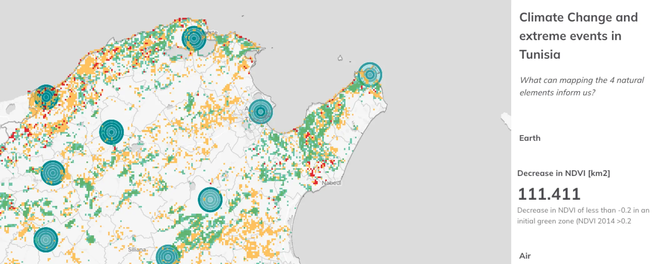
The Mediterranean region is widely recognized as one of the areas most affected by climate change. But has this projected impact already become visible and measurable in the last decade? To explore this question, we analyzed four natural elements — Earth, Water, Air, and Fire — by comparing satellite and ground-based data across different years and extreme events in Tunisia.
Satellite data play a central role in climate and environmental analysis. The Copernicus Programme, the European Union’s Earth observation initiative, provides open-access data through its Sentinel satellites, covering global environmental conditions at multiple spatial and temporal resolutions. Most satellite data are delivered in raster format — grid-based, georeferenced images in which each pixel stores a numeric value. To enable comparison between different dates and years within GOAT, the raster data used in this study were converted into vector data and then imported for visualization and analysis.
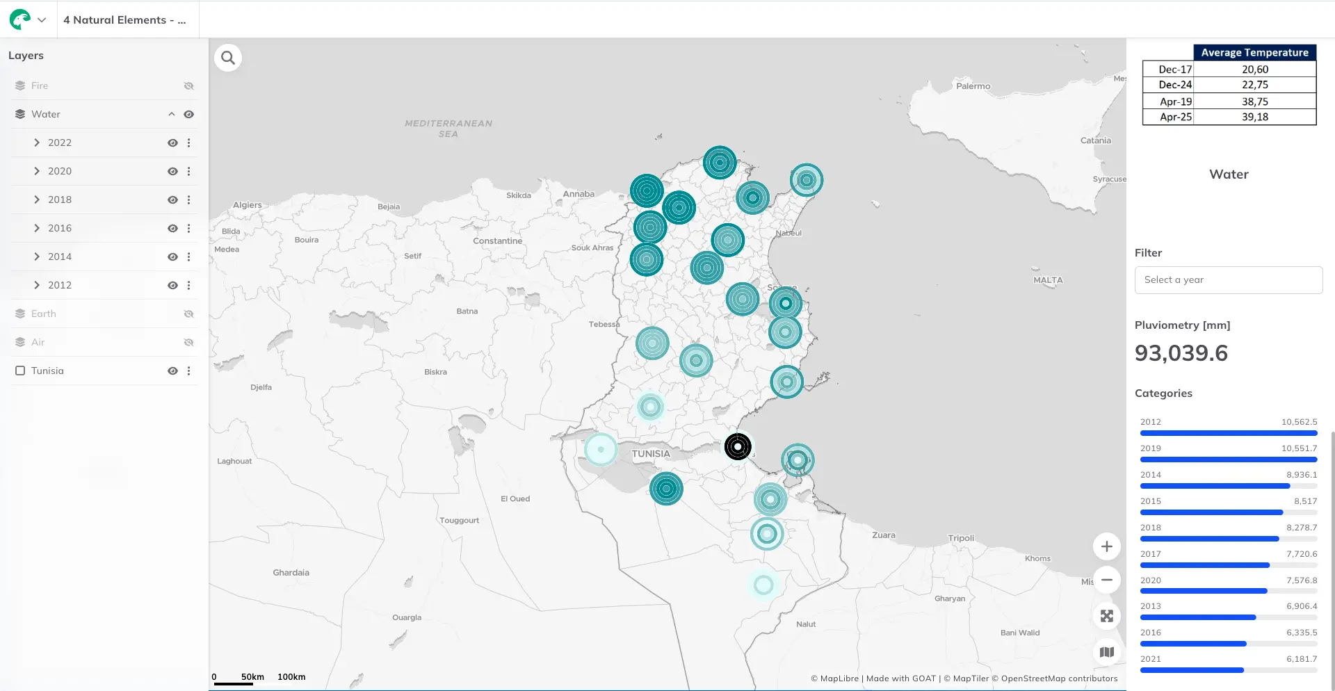
For the analysis of precipitation, no satellite-based dataset was available at the required temporal resolution to reliably compare individual years. Instead, we used ground-based pluviometry measurements from Tunisia’s national sensor network, which provide precise, point-based rainfall data collected over long time periods.
To visualize temporal change at each measurement location, every sensor point is represented by a series of concentric circles. The smallest circle in the center corresponds to 2022, while progressively larger circles in the background represent earlier years, going back to 2012. Color is used to encode precipitation intensity: the drier the year, the lighter the shade of blue.
Overall, the visualization suggests an intensification of drought conditions in recent years, both in terms of severity and persistence. 2021, 2022, and 2023 are the three driest years in the period from 2012 to 2023. While dry years were observed earlier, they were less severe and did not happen back-to-back as they do in recent years.
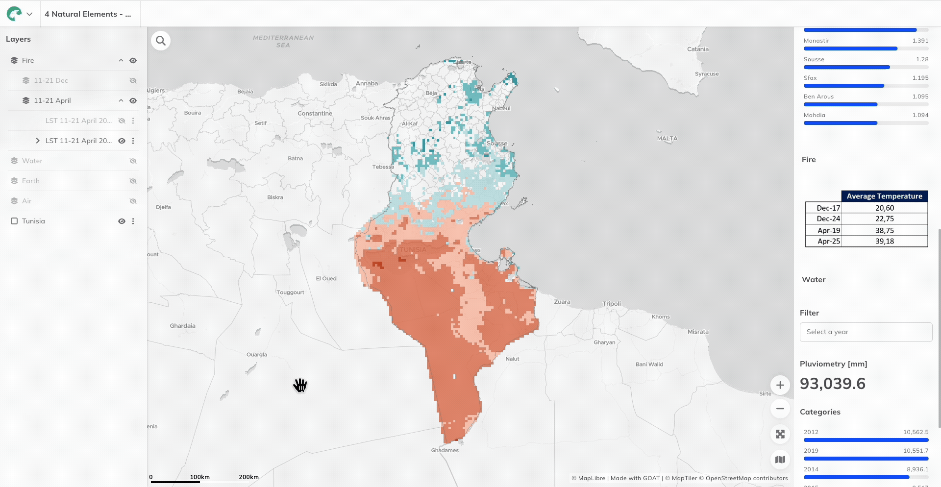
For this analysis, Land Surface Temperature (LST) data at a 5 km spatial resolution were used. We compared two two-week periods in different months: 11–21 April (2015 and 2019) and 11–21 December (2017 and 2024).
As expected, the maps show a clear north–south temperature gradient, reflecting Tunisia’s geographical and climatic conditions. Similarly, the difference between the two periods is evident, as one represents a spring/summer context and the other a winter context. More importantly, when comparing the same period across different years, a consistent pattern emerges: temperatures increase in every case, both in the north and the south of the country. This trend is visible regardless of season and cannot be explained solely by geographic or seasonal variation.
In this case, simple visualization — using consistent cartographic styling — is sufficient to make these changes immediately visible, highlighting the value of maps for detecting rising temperatures and extreme heat patterns.
Vegetation analysis using the Normalized Difference Vegetation Index (NDVI) requires careful interpretation. A simple difference map can be misleading, as it may even suggest vegetation improvement in arid or desert areas where NDVI values are naturally low and highly variable.
To avoid this issue, NDVI changes were analyzed in relation to the original land-cover type and limited to areas initially classified as green space. This approach allows the analysis to focus on meaningful vegetation changes rather than artifacts of the index itself. With this refinement, the results become clear: 132 km² of land experienced a decrease in vegetation of at least 0.2 NDVI units over the last ten years, indicating a substantial loss of vegetative cover.
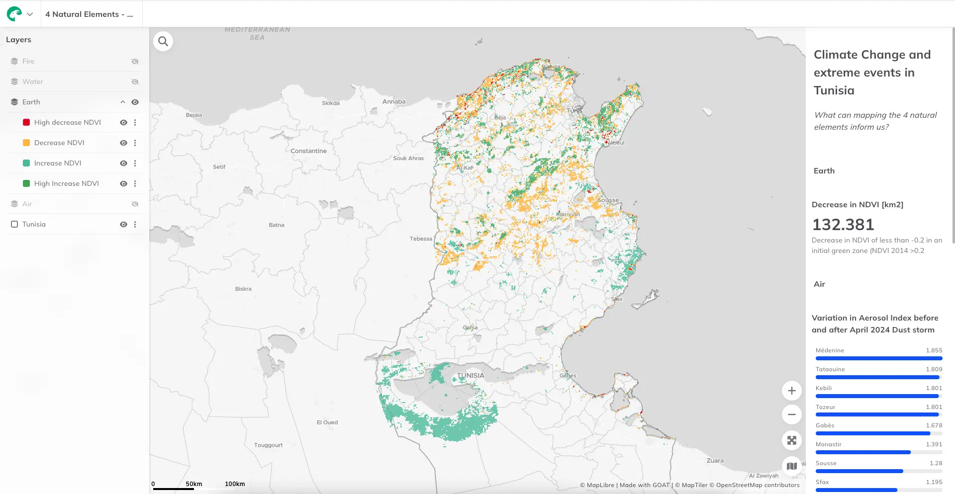
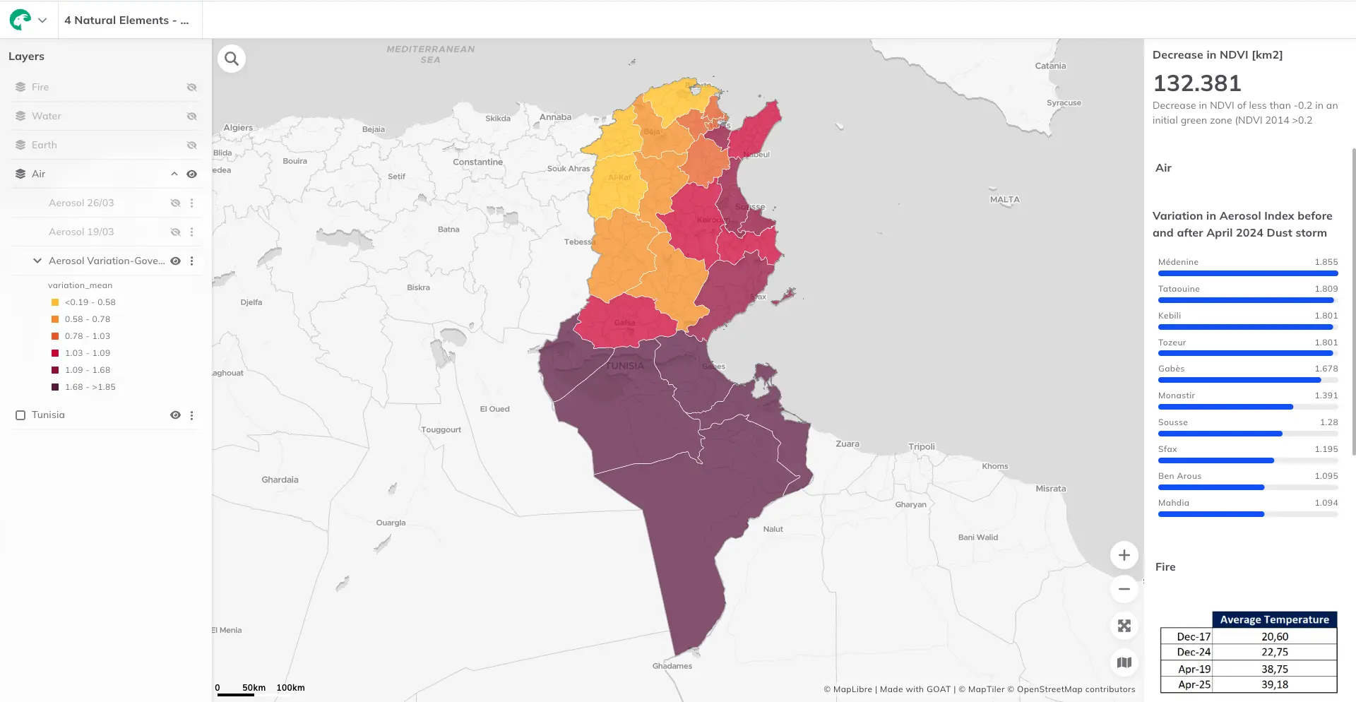
Unlike the previous analyses, which focus on long-term environmental trends, this case study examines a specific extreme event: a dust storm in Tunisia. Air pollution during the event was assessed using the Aerosol Index, which shows an extreme and sudden increase in atmospheric particulate matter.
Such peaks raise important questions beyond the individual event itself. Are these pollution levels hazardous to human health? And are dust storms becoming more frequent or more intense as climate conditions change? While this analysis does not answer these questions conclusively, it highlights how spatial data can help identify and contextualize extreme air pollution events.
A single map cannot determine whether observed patterns reflect natural variability or a direct effect of climate change. However, across three of the four analyzed elements — Water, Fire, and Earth — a clear pattern of environmental degradation is visible over the study period.
While mapping cannot replace statistical climate analysis, the combination of open-source satellite data, sensor measurements, and WebGIS tools provides a powerful framework for country-level climate monitoring. The interactive dashboard created for this analysis brings these elements together, allowing users to explore the results spatially and temporally, while this blog post focuses on explaining the underlying methodology and the key insights.
In this sense, spatial analysis serves as a crucial bridge between raw environmental data and informed discussions on climate change.

.jpg)
.jpg)
Join planners and cities already using GOAT to make better decisions, faster.