June 16, 2026
GOAT
We’re continuously improving GOAT, our open, web-based WebGIS platform for spatial analysis and data-driven planning across multiple disciplines. GOAT supports planners, public authorities, consultants, and researchers in working with complex geospatial data to make fact-based decisions.
With version 2.2.0 “Cashmere”, we introduce a refreshed user interface and long-requested features that make workflows more structured, efficient, and intuitive.
While the previous release focused on performance and speed, this update is all about usability and clarity: improved navigation, better data organization, and clearer ways to understand and manage projects — no matter the planning domain.
As part of Plan4Better’s mission to shape livable spaces and support sustainable development through innovative WebGIS solutions, GOAT 2.2.0 delivers improvements that directly support real-world spatial analysis and planning workflows.
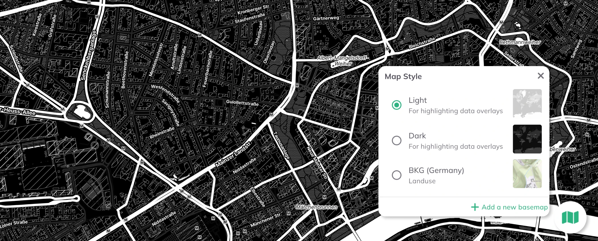
Data Mode has been completely refreshed with a cleaner, more intuitive interface. Floating panels now take up minimal screen space, giving more room to what matters most: the map.
The result is a more structured, consistent, and easy-to-understand workflow. Everything you need, exactly where you expect it.
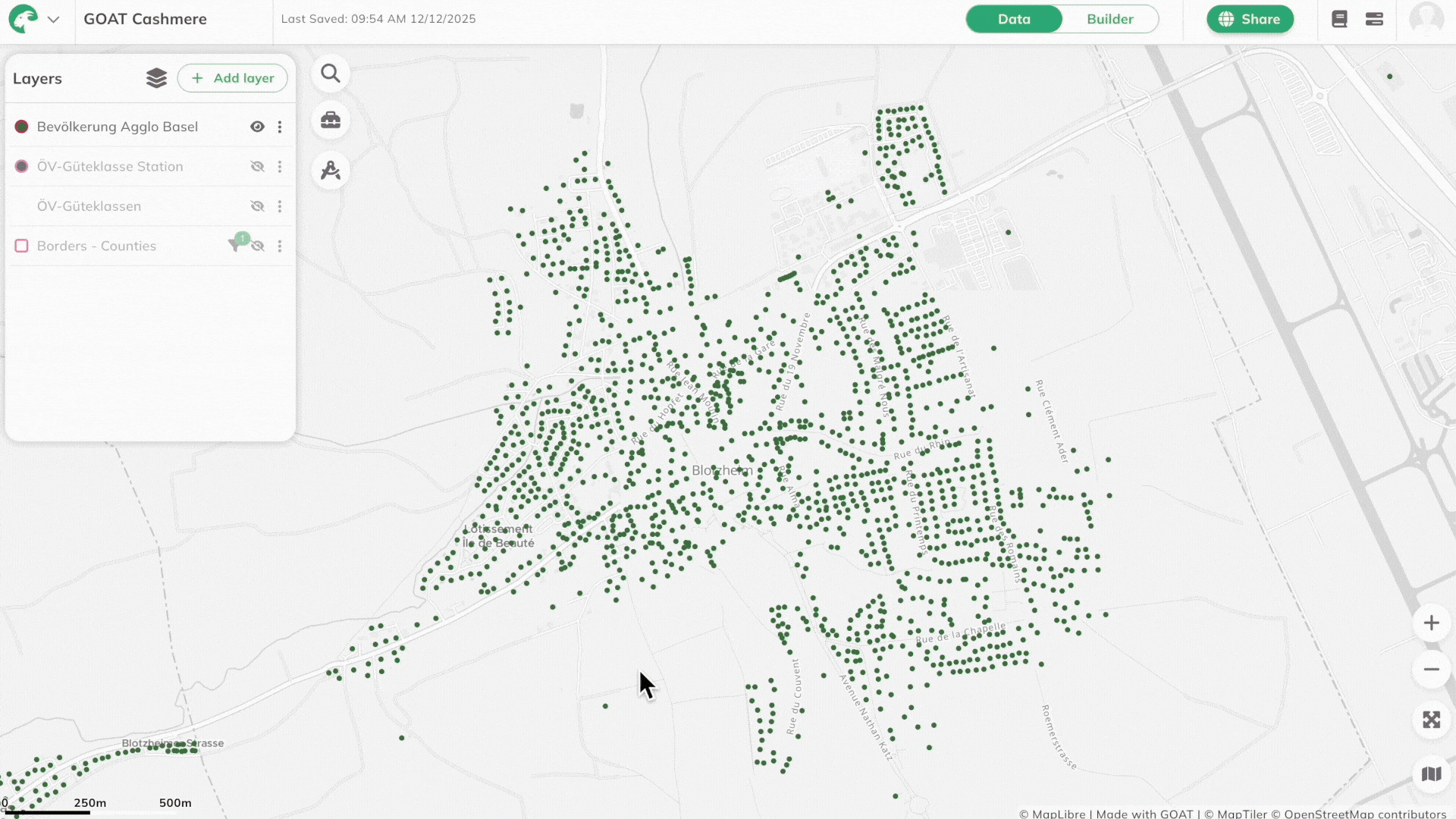
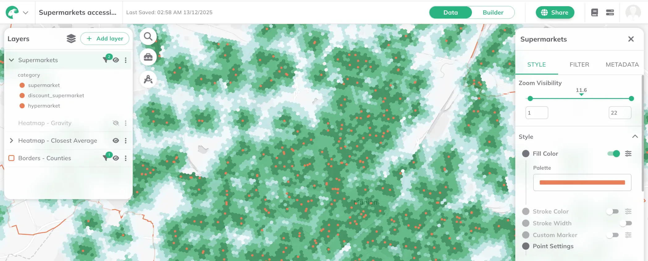
Oh yessss, the most requested feature is finally here 🎉. You can now group layers into logical collections, just like in other GIS tools. This helps you stay organized, reduce clutter, and keep complex projects manageable.
Dashboards are now collapsible. When sharing a map, users can easily show or hide dashboard panels, allowing them to focus on the map without losing access to insights when they need them.
Dashboards now open with a project information view that introduces the map and its purpose. This welcome screen helps users understand the context before diving into the data. A small change that makes shared maps much more accessible and self-explanatory.
Clients asked, we listened. It’s now possible to apply simple, lightweight style adjustments (such as opacity) to layers in public dashboards — perfect for quick visual refinements without complex styling.
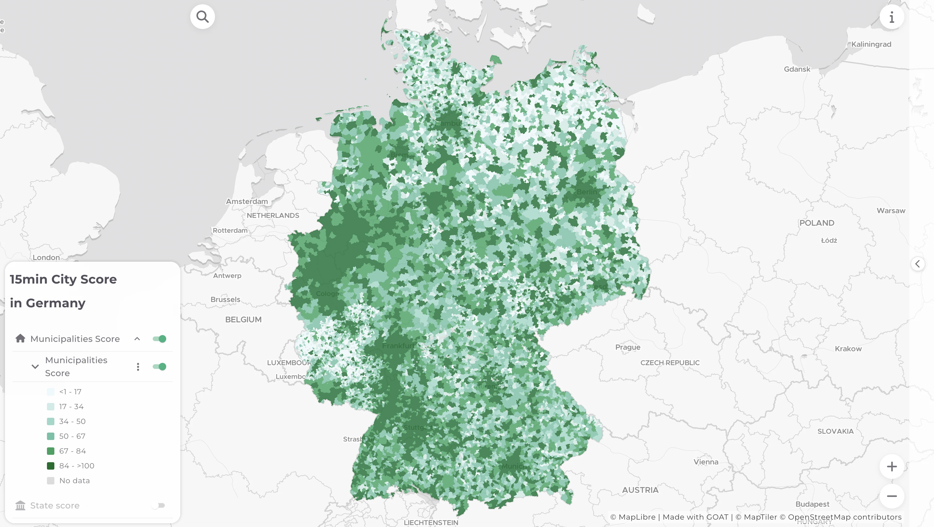
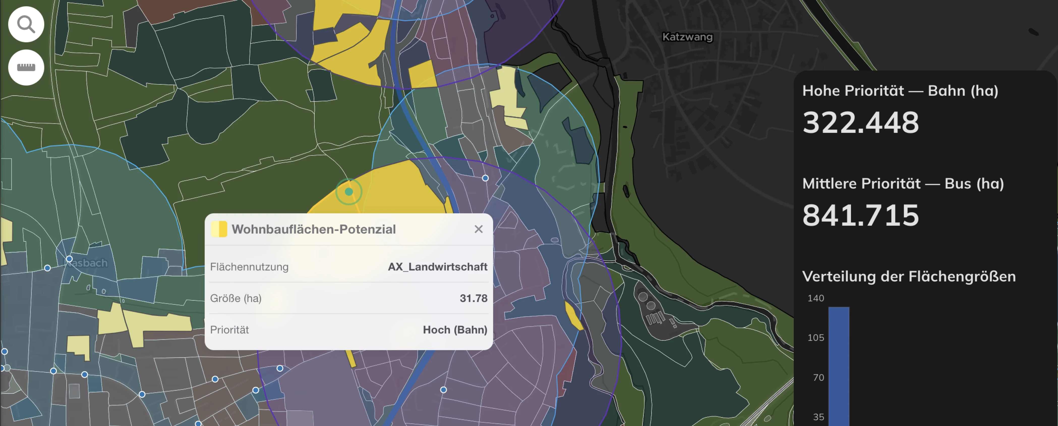
GOAT 2.2.0 isn’t just a visual update — it directly improves how you work with complex planning projects. With a clearer Data Mode, organized layer groups, and more flexible dashboards, you can structure large datasets, focus on what matters, and communicate insights more effectively. Whether you’re designing 15-minute cities, optimizing public transport networks, building climate-resilient communities, or improving accessibility for all, GOAT 2.2.0 helps you move from complex spatial data to clear, shareable decisions — faster and with less friction.
If you are not yet using GOAT, you can simply sign up for a free account to start your journey. And if you need help with the features, just check out our updated documentation featuring guides for all features, included the new ones.
Even our release names have meaning. Cashmere comes from the cashmere goat’s fine, soft winter undercoat — a material valued for being warm, lightweight, and high-quality. That’s exactly what GOAT 2.2.0 aims to be: powerful yet smooth, robust yet comfortable to work with. Whether you’re managing complex spatial data or simply exploring your city, GOAT 2.2.0 “Cashmere” has you covered.
Have questions or feedback about GOAT 2.2.0? We'd love to hear from you! Reach out to our team or join our community discussions.
Happy 2026 planning with GOAT 2.2.0 "Cashmere"!

.jpg)
.jpg)
Join planners and cities already using GOAT to make better decisions, faster.