July 14, 2026
GOAT
.webp)
Think about the last time you opened Google Maps. Chances are you already knew the way — you just wanted to check traffic, or see if something had changed. You didn’t read a table. You looked at a map.
That’s not a coincidence. Around 77% of smartphone users open a navigation app every day. Maps have become the default way most people make sense of what’s happening around them in space.
A map-based dashboard builds on that same idea — not just a dashboard that includes a map, but one where the map is the center, and everything else responds to it.
In this post, we look at what that actually means, why it matters for spatial planning, and where it’s most useful.

A map-based dashboard is a data visualization tool where the map is the primary interface — not a decorative element, but the organizing center that everything else responds to.
A dashboard, whether built around charts or a map, has one job: bring together multiple data sources and visualizations in a single interface, so that decision-makers can understand what’s happening at a glance.
The information on a dashboard is presented visually — usually a combination of text and graphics, but with an emphasis on graphics. That’s deliberate. Well-designed visuals communicate with greater efficiency and richer meaning than text alone. Numbers become patterns. Comparisons become obvious. Complexity becomes navigable.
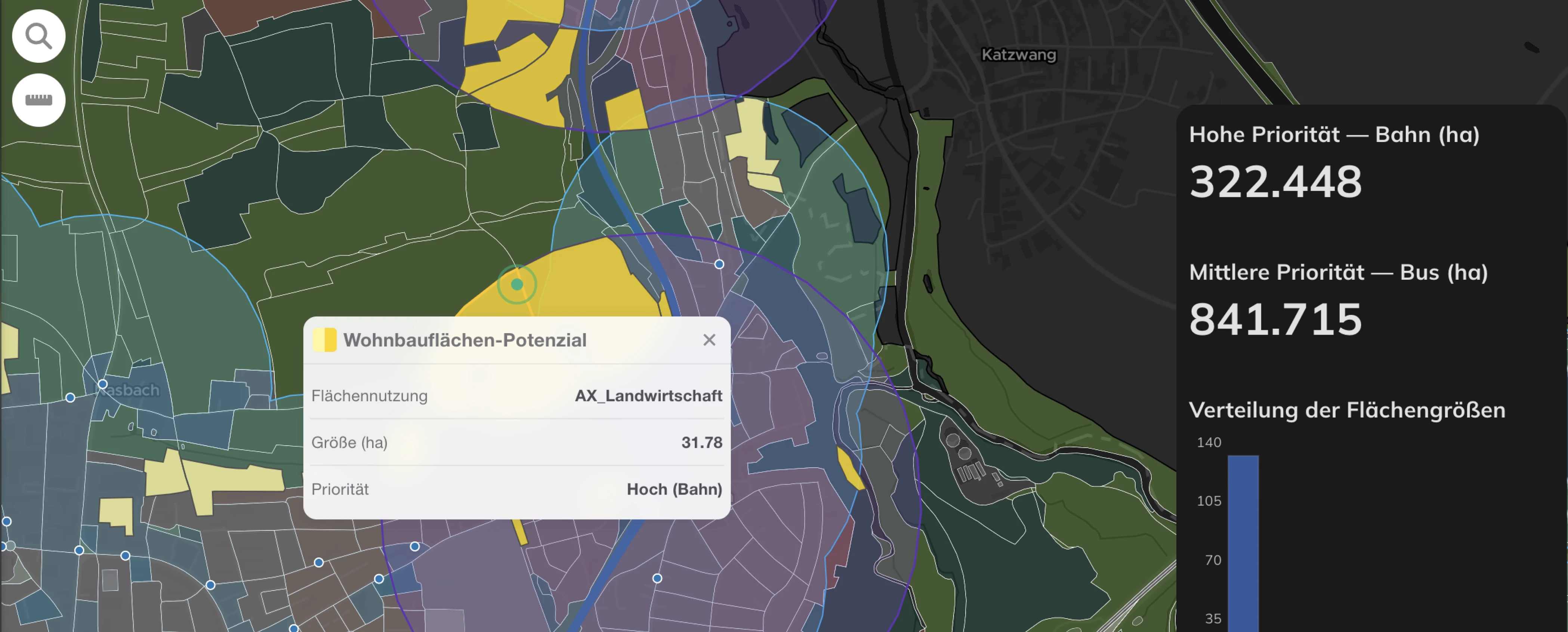
A map-based dashboard does all of this — but organizes everything around space. Instead of placing charts and KPI cards side by side, the map is the organizing principle. Charts and graphs are still there, and they matter — but they respond to the map. Click a neighborhood, and the bar chart updates. Apply a filter, and the spatial picture shifts. Every visual element is anchored to a location.
And unlike a traditional dashboard where everything must be visible at once, a map-based dashboard can work in layers. You turn data on and off, add or remove information as needed — without ever leaving the map. The complexity is there when you need it, and hidden when you don’t.
So the main difference is not about aesthetics. It’s about what sits at the center — literally and functionally. A traditional dashboard might include a map, but tucked into a corner, it plays a supporting role: a locator, a reference, a footnote to the charts around it. That’s not a map-based dashboard. In a map-based dashboard, the map takes up the space it needs to actually be used — to reveal patterns, carry context, and drive the rest of the data. The size is not a design choice. It’s a statement about what matters most.

It is estimated that up to 80% of all data has a spatial component — connecting information to a specific location through coordinates, street addresses, administrative boundaries, or postal codes. Most of what we know about the world around us is, at its core, about places.
And the problems spatial planning deals with are no different. Unequal access to schools, healthcare deserts, fragmented mobility networks, flood-risk zones, underserved rural communities — these challenges don’t exist in the abstract. They exist in specific locations, along specific roads, within specific boundaries. Knowing that 34% of residents live more than 1 km from a transit stop is one thing. But seeing which residents, which communities, under which conditions — that changes the conversation entirely. A map shows it instantly, without needing an extra column, a legend footnote, or a mental translation step.
Maps transform data into meaning. They locate problems, reveal patterns, and make inequalities impossible to ignore.
One billion people consult a map before making a decision. Every single day.
77% of smartphone users open a navigation app daily — Google Maps, Apple Maps, Waze, Amap. Most of the time, they already know the way. They open it to check traffic, spot a faster route, understand what’s happening around them in real time. They don’t read a table. They look at a map.
That’s a habit — but it’s also how human spatial cognition works. Psychologists call it a cognitive map — the mental model of the world we all carry in our heads, organized by place rather than by category or time. A map-based dashboard speaks directly to that mental model. It doesn’t ask users to translate data into space. It puts the data exactly where the brain already expects it to be.
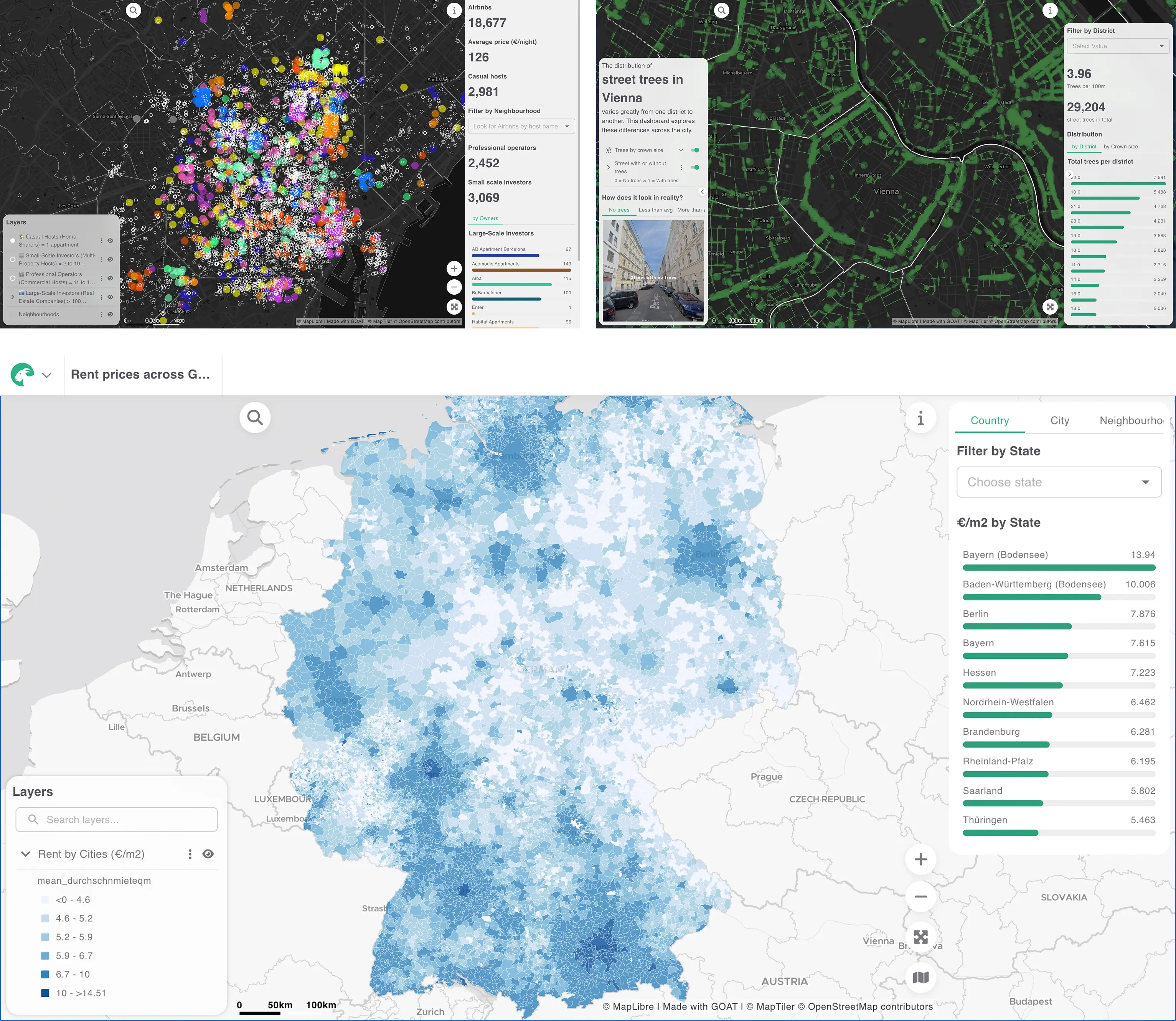
A single map layer can simultaneously show location, magnitude, pattern, density, and context — things that would require four or five separate panels, or a single chart pushed far beyond its limits. The map does this in a language people already know how to read. You don’t need a legend to understand that something is far away, or that two things are close together, or that a gap exists between two areas.
That’s what makes the map the most powerful organizing principle a dashboard can have. It compresses complexity without losing clarity. It gives every other element — every chart, every filter, every indicator — a spatial anchor.
That said, a map-based dashboard is not always the right answer. If the data has no meaningful spatial dimension — tracking website traffic, monitoring server performance, comparing quarterly revenue — a traditional dashboard will serve you better. The map earns its place at the center only when location is part of the story. But in spatial planning, it almost always is.
Map-based dashboards show up wherever understanding where something happens matters as much as understanding what is happening. In practice, you can use map-based dashboards for:
But knowing when to use a map-based dashboard is only half the challenge. The other half is designing it well — and not in terms of aesthetics. As Stephen Few put it, dashboards are above all else about communication. That means the decisions that matter are about structure, layout, hierarchy, and colour — more science than art, more simplicity than dazzle.
That’s what we’ll explore in our next post.
In the meantime, if you want to start building your own map-based dashboards, GOAT gives you everything you need — layers, charts, filters, and a map at the center. Try GOAT for free →
GOAT
.png)
Development
.jpg)
.jpg)
Join planners and cities already using GOAT to make better decisions, faster.