June 30, 2026
Development
Where should the next childcare center go? Which neighborhoods are underserved by public transport? Is there actually enough purchasing power around a new supermarket to make it viable? These aren't abstract planning questions — they're decisions that shape how people move through their cities every day. And they all start with the same thing: an accessibility analysis.
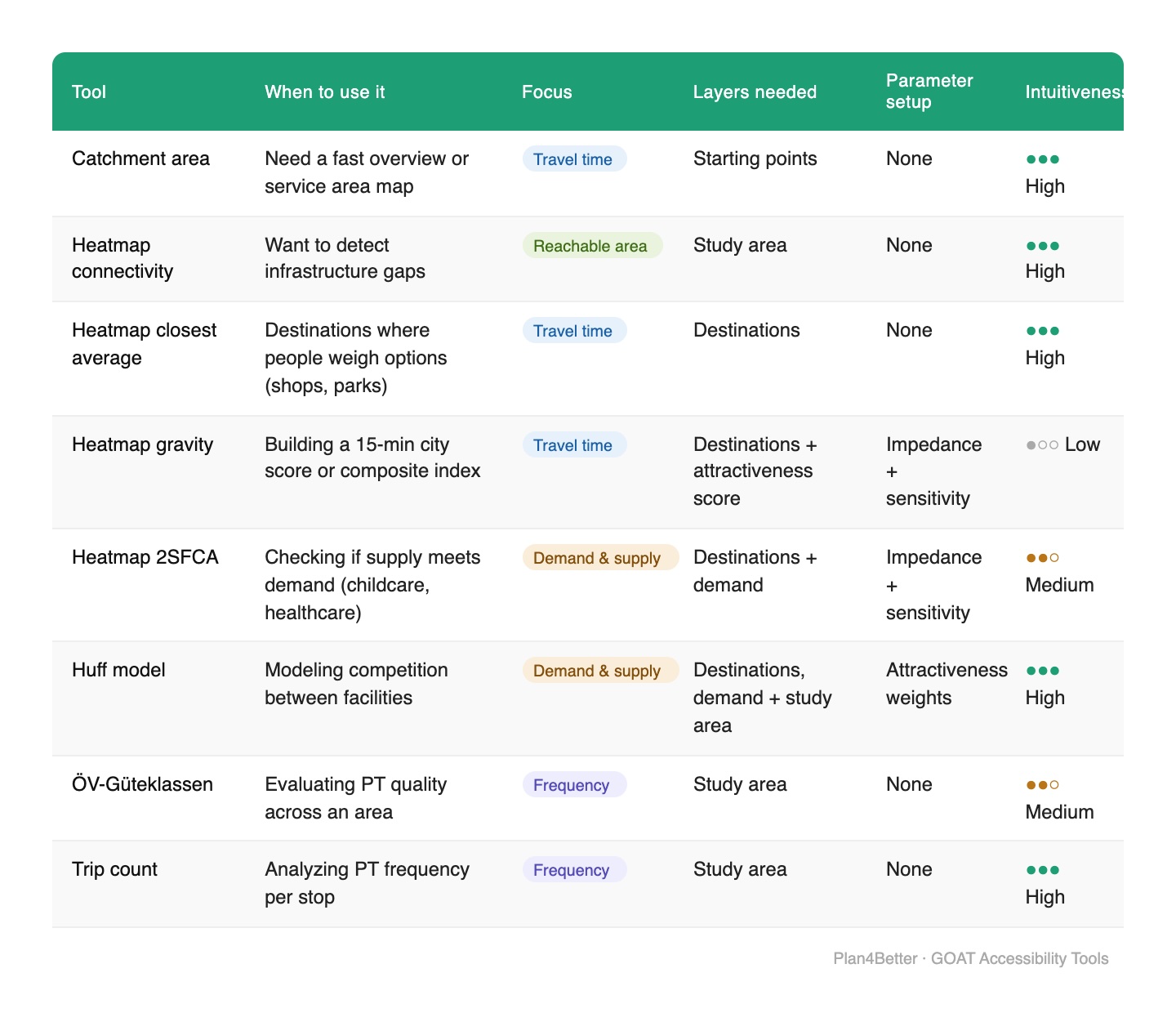
But here's the catch: accessibility can be measured in dozens of ways. Choose the wrong method and you might miss the story your data is trying to tell. That's why GOAT brings together 8 tried-and-tested accessibility tools — each designed for a different kind of question.
.webp)
Not sure which one fits your project? This guide walks you through each method, using the same real-world case study throughout — childcare accessibility in Hardtberg, Bonn — so you can see exactly how each tool transforms the same data into different insights.
The most intuitive starting point. Draw a travel-time boundary around any origin — a supermarket, a school, a bus stop — and see who falls inside it.
How many residents live within a 15-minute walk from a childcare center? How many destinations can be reached from the central train station in 30 minutes by public transport?
In Hardtberg, a 10-minute walking catchment from each childcare center immediately reveals which neighborhoods are covered — and which are left out.
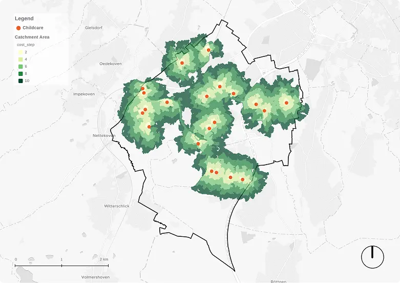
When to use it: Quick overviews, service area mapping, stakeholder presentations. It's the most widely used accessibility method in GIS — intuitive, available in virtually every platform, and readable by anyone.
Limitation: It tells you who can reach a facility, but not whether there's enough room for them. A center with 10 spots looks identical to one with 90 — the isochrone doesn't know the difference.
Sometimes the nearest option isn't the only one that matters. When it comes to supermarkets, people often compare a few options before deciding — picking the cheapest one, or the one with the best organic selection. This tool calculates the average travel time to the nearest n destinations — giving a more realistic picture of perceived accessibility.
What's the average walking time to the 3 nearest supermarkets in each neighborhood?
For childcare in Hardtberg, the closest average to the 3 nearest centers shows that the northern facility feels less accessible than its location alone would suggest — because nearby alternatives are sparse.
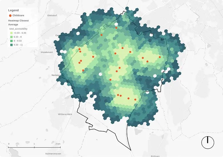
When to use it: Any destination where people weigh options: shops, parks, leisure facilities.
Note: For childcare, families usually go to the closest available spot. So for this case study, the closest average is less relevant, but it's a useful contrast to show how method choice shapes your conclusions.
A catchment tells you if people can reach a destination. Gravity-based accessibility tells you how well — by factoring in both distance decay (people's willingness to travel) and destination attractiveness (size, capacity, or quality).
The result is a composite index: the higher the score, the better the combined access. It's unitless, so it works best for comparing areas rather than reading absolute values.
Which neighborhoods score highest on a 15-minute city index, combining access to schools, green space, healthcare, and retail?
In Hardtberg, the gravity map shows that the far western area is less accessible than the closest-average map suggested — because this method rewards having multiple good options nearby, not just one.
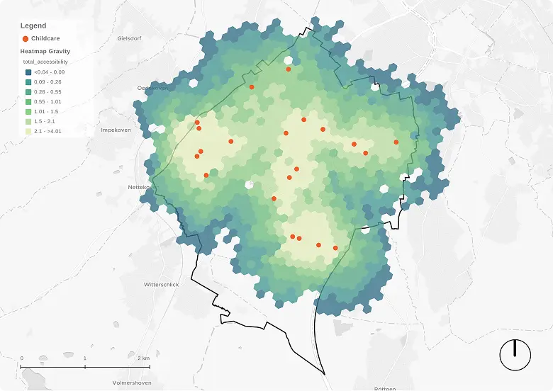
When to use it: 15-minute city scoring, composite accessibility indices, comparing planning scenarios.
Heads up: Requires choosing an impedance function and sensitivity parameter. Learn more about how the gravity model works →
This tool asks a different question: not where people want to go, but whether the infrastructure lets them. It calculates the total reachable area within a time threshold for each grid cell — making gaps in the network visible.
Are there streets or paths missing that cut off certain neighborhoods on foot or by bike? Which areas are isolated from public transport at certain times of day?
In Hardtberg, the southeast shows low connectivity — not because destinations are far, but because green space and sparse street coverage make it harder to move in any direction.
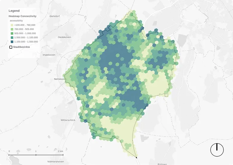
When to use it: Identifying infrastructure gaps, prioritizing new paths or bridges, analyzing nighttime PT isolation.
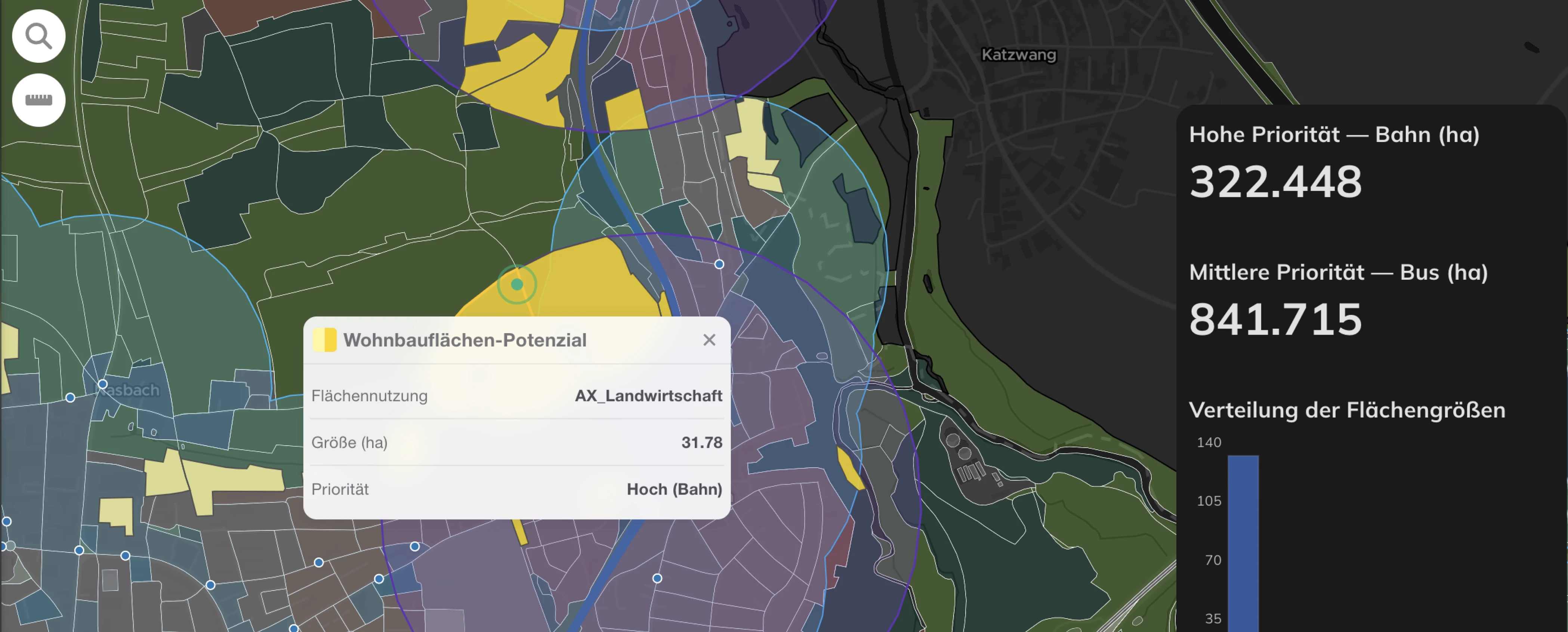
Here's a problem a catchment area can't solve: imagine a childcare center with 20 spots serving a neighborhood of 60 children under 6. A standard isochrone would mark the area as "served." But four out of five families have nowhere to go.
The Two-Step Floating Catchment Area (2SFCA) fixes this by balancing supply (capacity) against demand (population need). The result shows not just where facilities exist, but whether they're enough.
Are there sufficient childcare spots for children under 6 within a 10-minute walk? Does the purchasing power around each supermarket exceed its sales capacity?
In Hardtberg, the center of the district has multiple childcare centers with capacity to spare. But move to the edges, and demand outstrips supply — meaning families there are likely traveling further than they should.
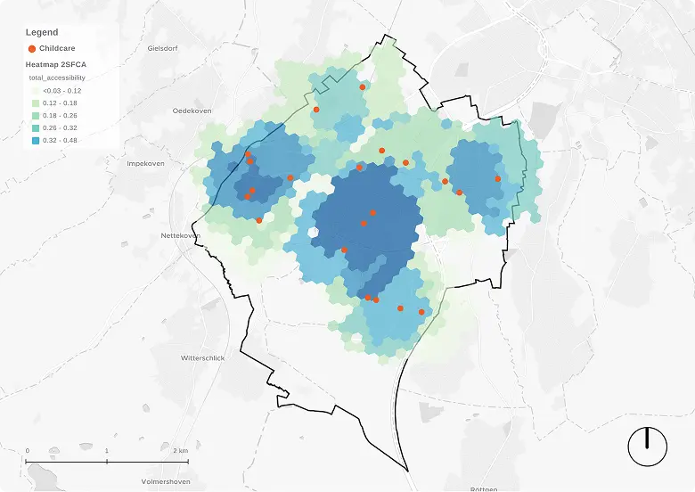
When to use it: Any situation where capacity matters: childcare, healthcare, retail. The go-to method when you suspect a service exists on paper but is oversubscribed in practice.
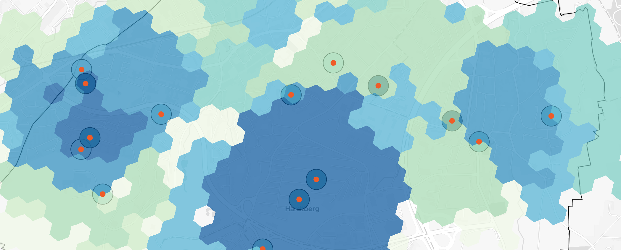
The 2SFCA tells you if there's enough supply. The Huff model tells you how demand is distributed across competing options — based on distance and attractiveness.
Think of it like this: if two childcare centers are equally close and equally large, each attracts roughly half the local children. If one is larger or closer, it pulls more. The Huff model captures this competition and outputs a market share for each destination.
What share of local shoppers does each supermarket attract? Which park gets more visitors — and where should new infrastructure go to balance that?
In Hardtberg, the highest Huff probability sits in the northeast — up to 13% of children in the area are drawn to one facility. But that center can't meet the surrounding demand. A new childcare facility nearby could absorb the overflow.
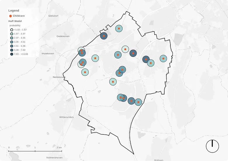
When to use it: Retail planning, park prioritization, any scenario where facilities compete for the same users.
A stop on the map doesn't mean much if the bus comes once an hour. Trip Count measures exactly that: the number of departures per platform within a defined time window, broken down by service type (bus, tram, metro, rail).
Which stops are most frequent during the morning rush? Where should we prioritize accessibility improvements?
In Hardtberg, the southeast has public transport stops — but low trip counts mean long waits. Proximity alone doesn't mean good service.
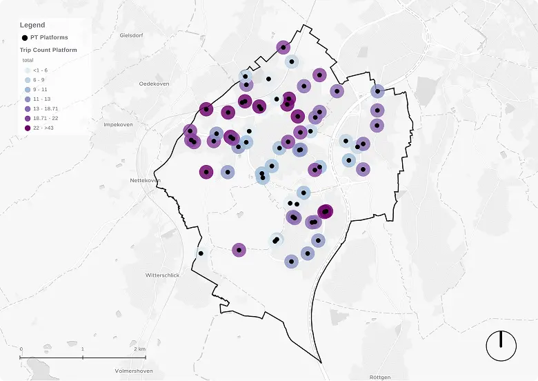
When to use it: Identifying underserved stops, comparing service frequency across a network, prioritizing infrastructure investment.
Trip Count tells you how often services run. ÖV Güte tells you how good they are — combining frequency, service type, and walking distance to the stop into a single A–F score. Widely used in Swiss and Austrian planning, it captures the true value of nearby transit, not just whether a stop exists.
Which residents are stuck with low-frequency, low-quality public transport? Which areas become isolated at night?
In Hardtberg during morning peak hours, the highest quality (Class A) is found in the northwest near the S-Bahn station in Duisdorf. But quality drops significantly further east and south — useful insight for prioritizing investment.
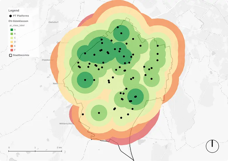
When to use it: PT network audits, identifying underserved areas, comparing service quality across a region.
There's no single winner — and that's the point. The right method depends on your data, your question, and who you're presenting to. Here you can dive into them with a short summary of each:
The best analyses often combine more than one. In Hardtberg, pairing the 2SFCA with the Huff model revealed not just where demand exceeds supply — but which facility is most likely to absorb it.
Want to try these tools on your own city? → Explore GOAT
.png)
Development
Insights
.jpg)
.jpg)
Join planners and cities already using GOAT to make better decisions, faster.