June 16, 2026
GOAT
There's a particular type of dashboard that looks impressive at first glance. Lots of data. Nice colours. A map somewhere in there. And then you stare at it for a moment and realise — you're not sure what it's trying to tell you.
That's not a data problem. It's a design problem. Specifically, it's what happens when a dashboard is built around "what data do I have?" instead of "what do I want people to understand?"
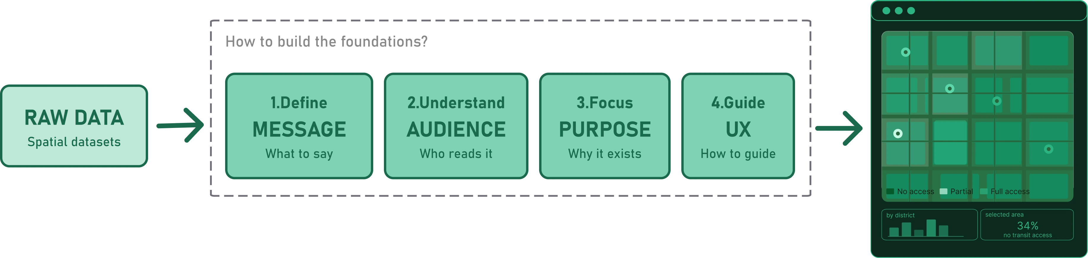
Making a map-based dashboard isn't that different from making a map. You still need a topic, a message, an audience, and a path. The difference is that a dashboard is interactive by nature — it invites people in, and then it has to guide them somewhere. To do that well, there are four things worth settling before you touch the interface.
This is the second post in a series on map-based dashboard design. If you missed the first — What is a Map-based Dashboard? — it's a good place to start.
The first question isn't "what data do I have?" It's "what do I want people to understand?" That shift — short in words, big in impact — changes every decision that follows.
Usually, there isn't just one thing to say. There's a core message and a set of supporting ones — findings that together build the full picture. The work is in ordering them: which one opens the dashboard, which ones give it depth, which ones are secondary detail.
The more specific each message is, the better. "Green spaces are not equally accessible" is a starting point. "Green spaces are less accessible in Munich's northern neighbourhoods than in the south — and the gap is largest for residents without a car" is a dashboard. The first tells you there's a topic. The second tells you there are at least three things worth showing: the overall distribution, the north/south pattern, and the mobility dimension.
Writing out your messages before touching the interface is worth the time. Not as bullet points to display, but as internal anchors — the things you want someone to walk away knowing. Once those are clear, the layers, the graphs, and the order of the experience start to fall into place.
The same dataset can tell very different stories depending on who's reading it. A dashboard for politicians looks different from one for planners, which looks different from one for citizens — not because the data changes, but because the questions change.
Take green space accessibility in Munich. The data is the same. But what each audience needs from it isn't.
A politician wants a clear, complete picture: how does Munich compare to other cities? What percentage of residents are underserved? Something that communicates the scale of the issue and supports a decision. A planner wants to dig into the pattern — which neighbourhoods fall short, which population groups are most affected, where an intervention would have the most impact. A citizen wants to know what this means for their street, their kids, their daily life. A researcher might be most interested in the methodology: how was accessibility measured, what counts as a green space, what are the limitations of the model.
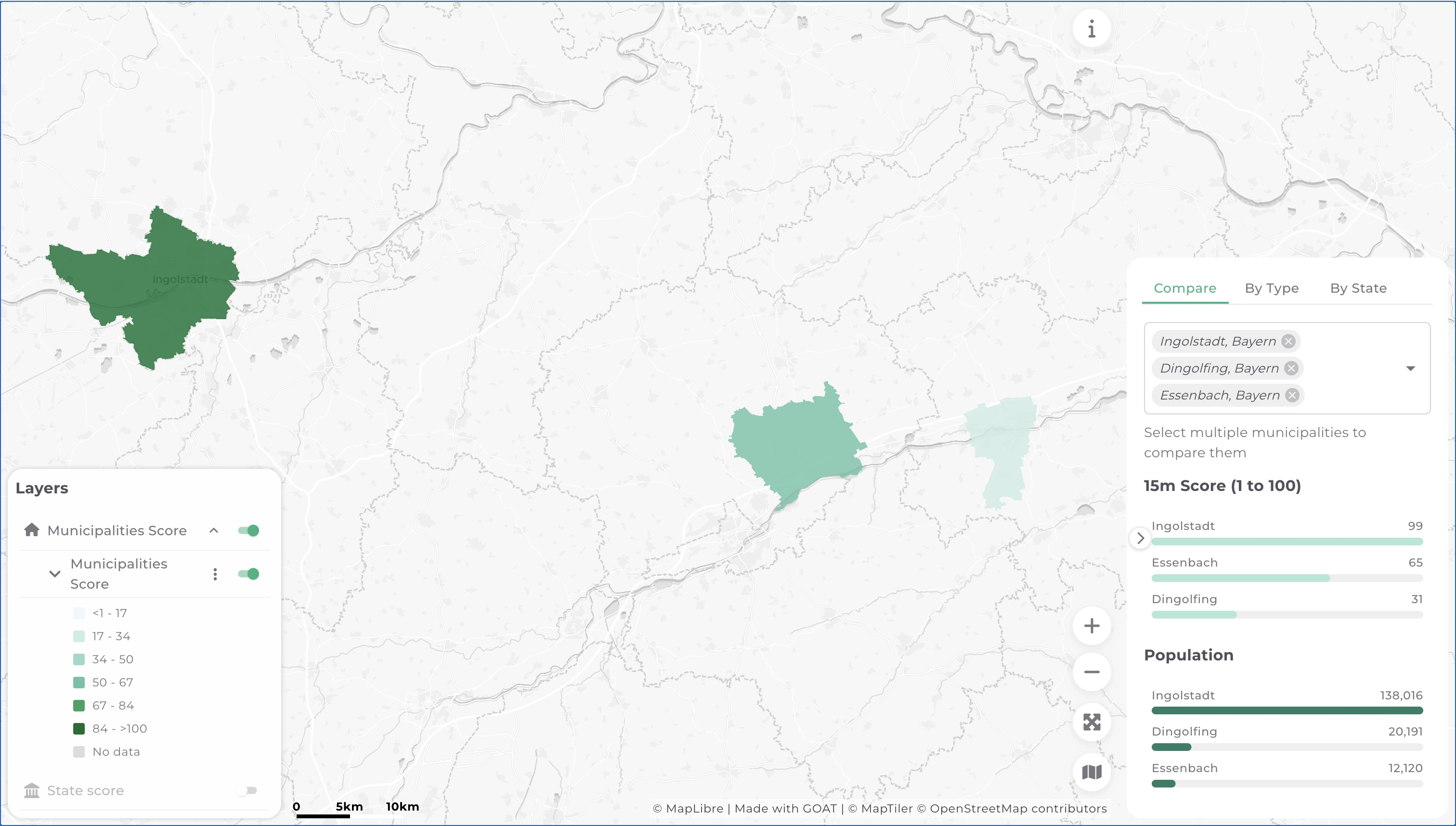
These are examples, not fixed categories. Researchers often work alongside planners and need answers just as much as process. A construction department and an equality team might sit in the same room with very different priorities. The point isn't to stereotype audiences — it's to acknowledge that the same map means different things to different people, and designing for everyone at once usually means serving no one well.
Depending on who's looking, the dashboard needs to surface different things. Here, tabs and filtering within the dashboard play a big role
Most dashboards end up with more than one audience. That's fine. But it means you need to prioritise. Knowing who the primary reader is resolves most design conflicts before they start — what to show first, how much detail to surface, how much the user needs to be guided versus left to explore.
Dashboards serve different purposes, and it's worth naming the one you're building before you start.
Some exist to monitor a situation — to help decision-makers know what's happening without having to ask. Others are built to educate, to bring findings to a broader public. Some are meant to support a specific decision: where to build, what to prioritise, where the gaps are.
Going back to Munich's green spaces: if the primary audience is planners, the purpose probably isn't to monitor — it's to support a decision. Which neighbourhoods should be prioritised for new green space investment? That question shapes everything: what the geospatial dashboard needs to show, how detailed it should be, and crucially, what it doesn't need to include.
That last part matters. A dashboard can't — and shouldn't try to — replace a spatial analysis tool. It answers known questions that people ask regularly, not every possible question someone might have. Think of it like a car dashboard: speed, fuel, temperature. It doesn't explain the engine. If something unusual appears, that's when the analyst goes deeper — elsewhere.
Trying to make a dashboard that does everything produces something too complex to use. The most useful ones are focused. They answer: are we on track? What changed? Where should we look next? If a planner needs to slice the data in a new way every session to answer a different question, that's analysis work — and there are better tools for that, like GOAT ; ).
Once you know the message, the audience, and the purpose, there's one more question: how do you want the user to move through the dashboard?
Before getting into that, it's worth clarifying what makes this question different for a map-based dashboard. In a standard dashboard, the charts tell the story— you read graphs, tables, and numbers, and the map (if there is one) illustrates the data. In a map-based dashboard, the relationship is reversed. The map takes most of the space. It's not just a visualisation layer — it's the organisational structure of the whole interface. The graphs don't lead; they respond to what the map shows. Rather than navigating between tabs or filters, the user moves through space — and zoom levels do much of the work that buttons and menus do elsewhere.
That changes how you think about the user experience entirely. While writing this article, I came across an image that I think captures it well.

It helps to think of three modes. A traditional story — like a story map — walks the reader through a fixed sequence. It's not really a dashboard; it's a narrative. At the other end, self-exploration leaves the user completely free: turn layers on and off, connect data to graphs in whatever order makes sense, arrive at your own conclusions. Two people might use the same dashboard and come away with different readings. Then there's the guided safari — the user can still explore, but layers are connected to specific graphs and tabs, so turning one on redirects you somewhere deliberate. There's freedom, but the destination is roughly shared.
For the Munich green spaces dashboard aimed at planners, a guided safari probably fits best. The opening view shows the city-wide distribution — which neighbourhoods are well served, which aren't. Zoom into a district and the detail emerges: individual parks, population density, walking distances. Zoom further and you reach the street level, where the question becomes specific enough to support a real decision. The graphs update to match where you are on the map. The territory isn't background — it's the argument.
A dashboard that knows its message, its audience, its purpose, and its path isn't just easier to build. It's easier to use. And it's much more likely to do what data is supposed to do: turn numbers into something a person can act on.
This is part of what shaped how we built dashboards in GOAT. The map is always the primary interface. The graphs respond to it. The zoom level is the navigation. In the next post, we'll look at what makes a dashboard come to life — the visual and interactive resources that help users find their path, understand the message, and arrive at the questions we want them to ask.
If you're working on a spatial planning challenge and want to see what a map-based dashboard looks like in practice, explore GOAT →
.webp)
Insights
.jpg)
.jpg)
Join planners and cities already using GOAT to make better decisions, faster.