July 14, 2026
GOAT

At Plan4Better (P4B), we specialize in transport infrastructure, urban and environmental planning. Our work revolves around geodata, spatial analysis, and digital planning tools, helping cities and governements design livable spaces. At the heart of our workflow is QGIS, the open-source GIS platform which we integrate with our open-source tool GOAT, and together they enable us to process, analyze, and visualize complex spatial data efficiently. Today, our GIS Analyst, Gokul Gopan along with myself, Camila Narbaitz, cartographer of the team, tell the story of how we implement QGIS within P4B.
Our team chose QGIS to solve several core challenges in our planning workflow: we needed to collaborate effectively on maps as a team, manage and integrate many different datasets from various sources, and automate repetitive tasks to save time and ensure consistency across projects. Most importantly, we needed a tool that could seamlessly integrate with our open-source planning tool GOAT to create a cohesive ecosystem for data-driven planning.
QGIS is a powerful open-source tool that aligns perfectly with this mission. Unlike proprietary software like ArcGIS, it allows us to customize workflows without licensing costs. This flexibility is crucial for our projects, where we often need to adapt tools to specific planning challenges.
What sets QGIS apart for us is its community-driven development. We leverage existing plugins and create our own to automate those repetitive tasks like applying style templates and map design, which directly addresses our need for efficiency and project consistency.
As mentioned previously, QGIS integrates seamlessly with our open-source tool, GOAT, creating the cohesive planning ecosystem we were looking for. This combination enables us to improve our spatial analysis, and provide our clients with a tool to make data-driven decisions.
Our typical process involves four main steps:
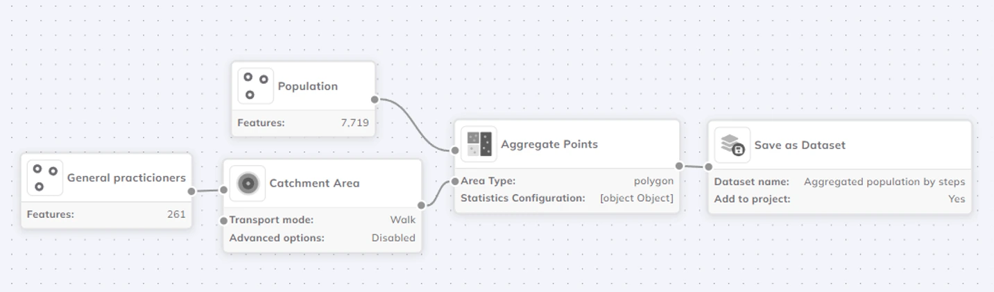
We begin by carefully curating the necessary datasets. This includes gathering the necessary demographic datasets, GTFS transit feeds, open public data sources (like OpenStreetMap extracts) from our already created catalog, and integrating proprietary datasets provided by our clients. This initial step is crucial for creating a unified and comprehensive spatial data foundation for any project.
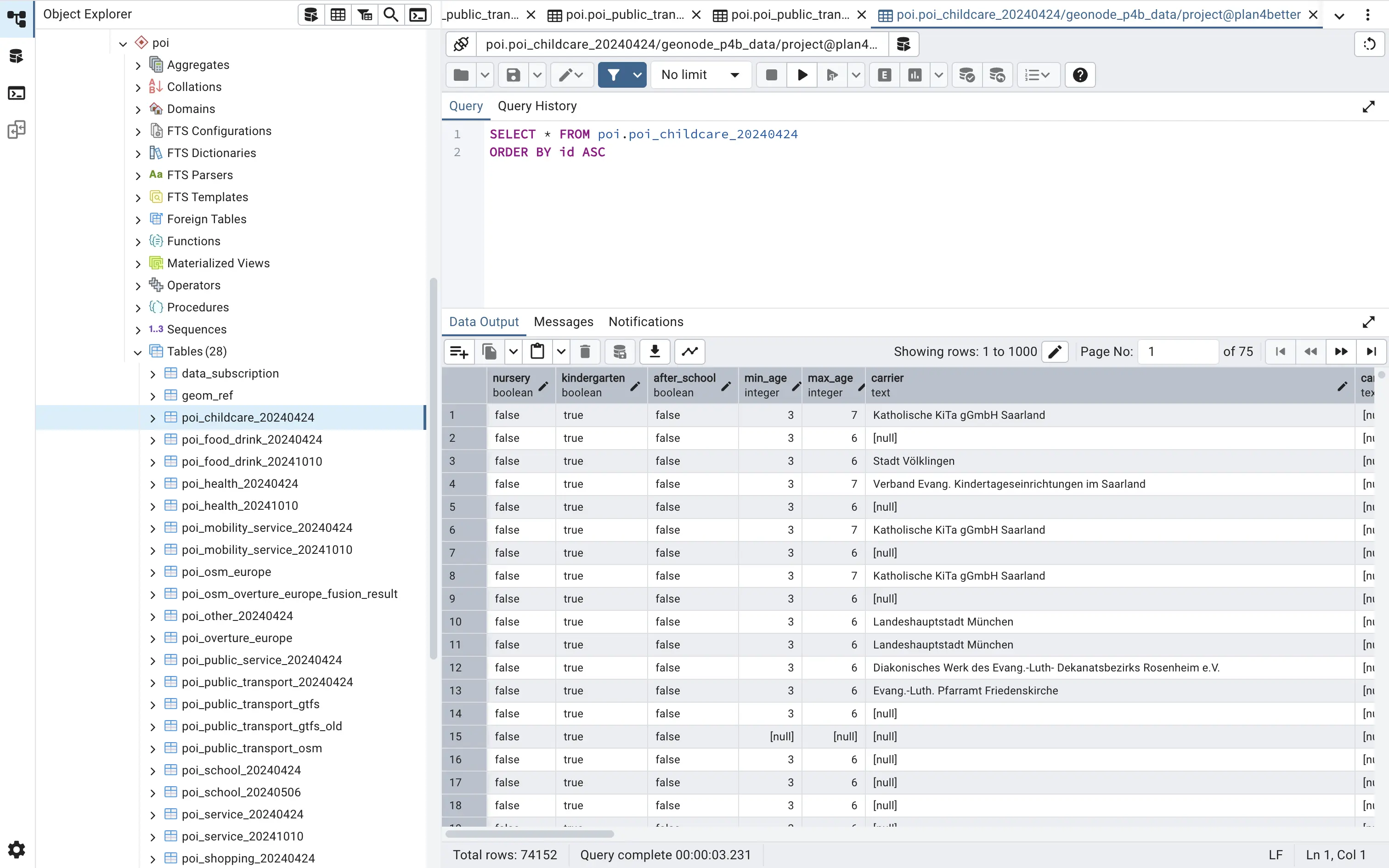
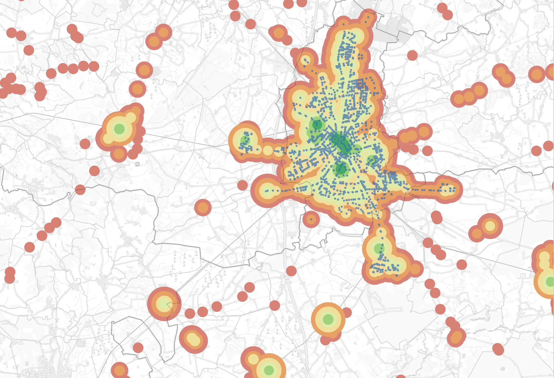
All collected spatial data is then systematically integrated and stored in a central, specially configured PostgreSQL/PostGIS database. Using PostGIS functions, we perform essential spatial operations—such as querying, analyzing, and manipulating geographic data—directly within the database. This approach allows us to efficiently manage and process complex datasets, ensuring high performance and data integrity before we even open QGIS.
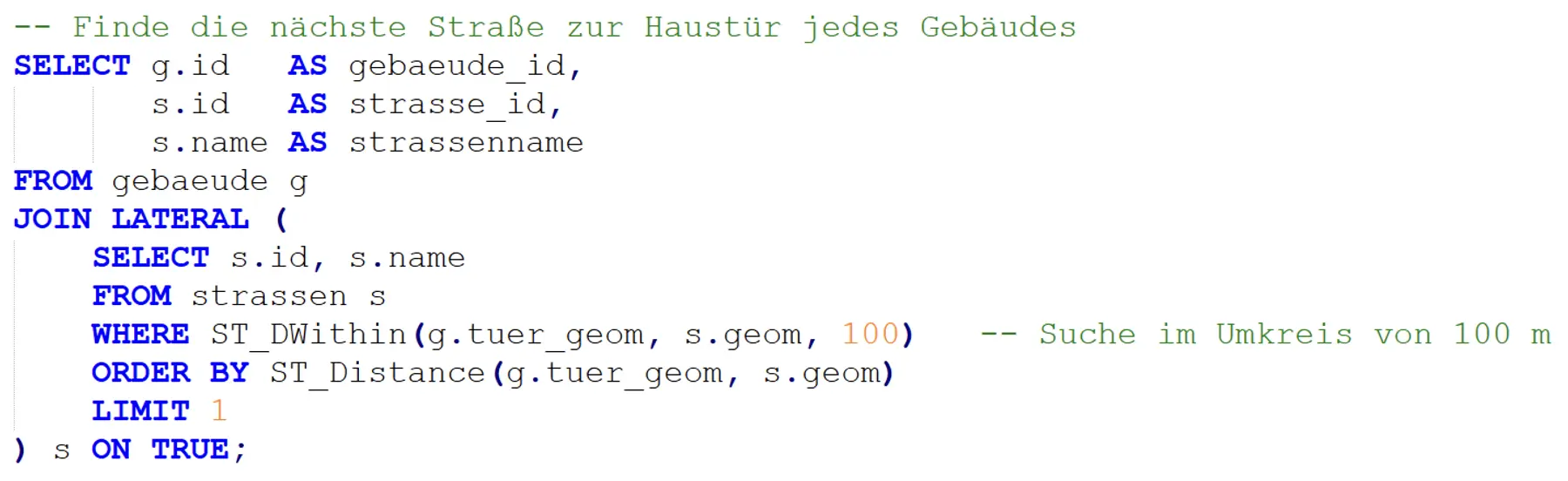
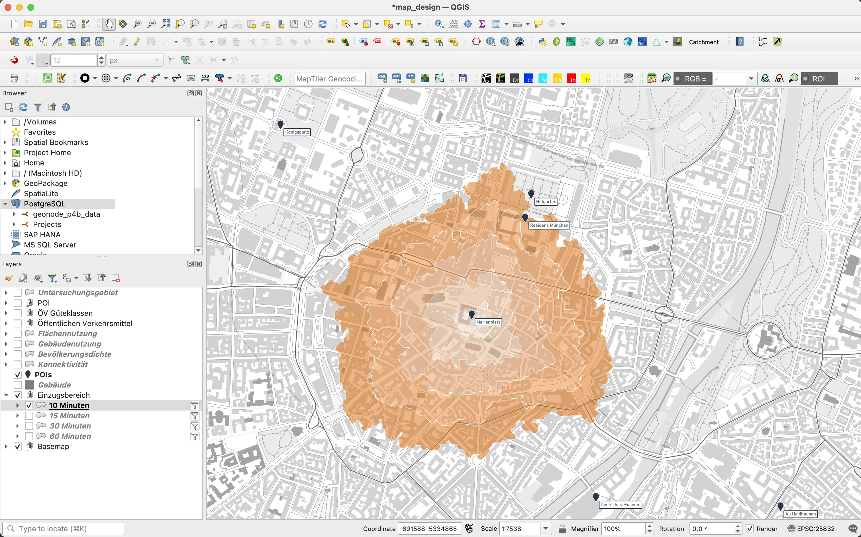
With our data prepared in PostGIS, we connect to it directly within QGIS to perform advanced spatial analyses. To automate repetitive tasks and ensure methodological consistency, we leverage and develop custom PyQGIS scripts and plugins. This automation saves valuable time and reduces the potential for manual error during complex analytical processes.

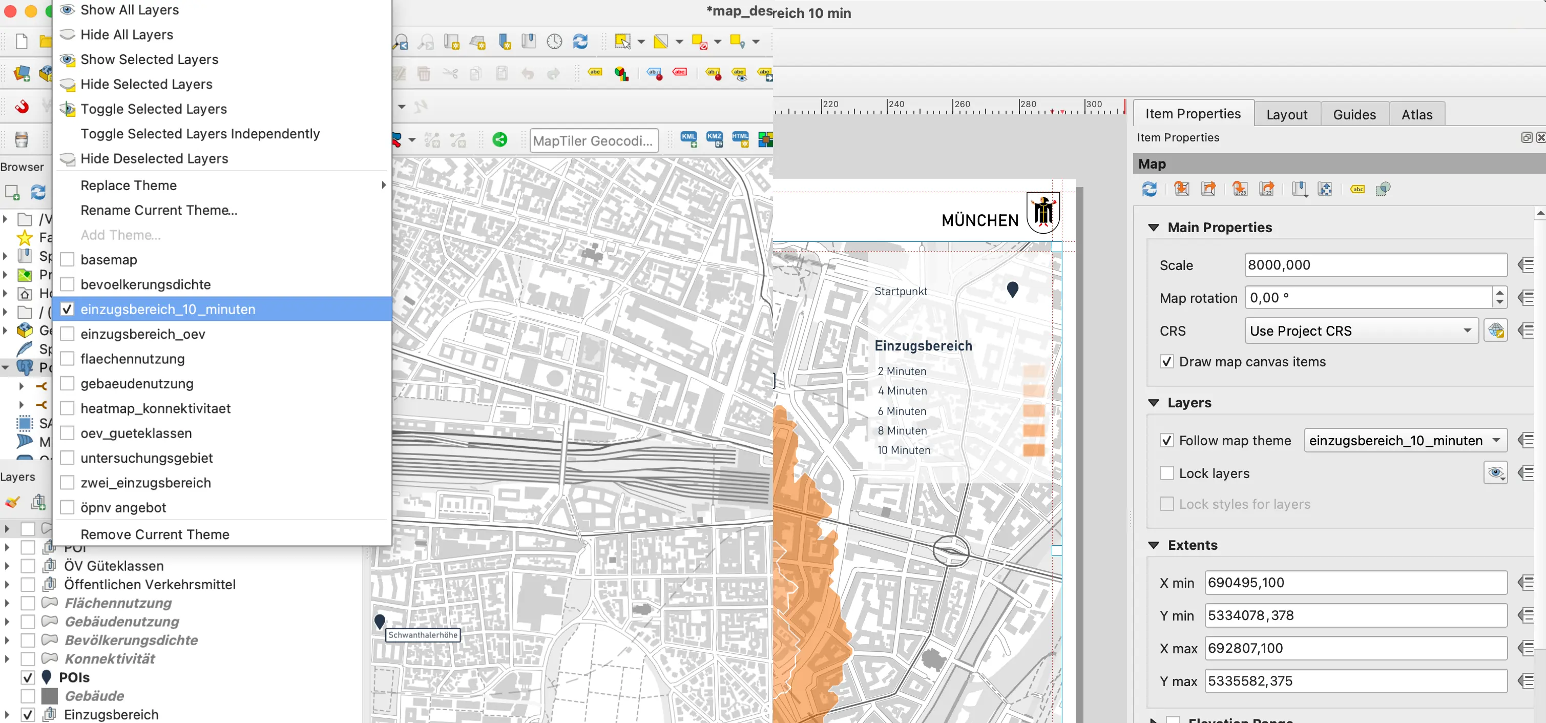
4. Map Creation, Styling & Verification
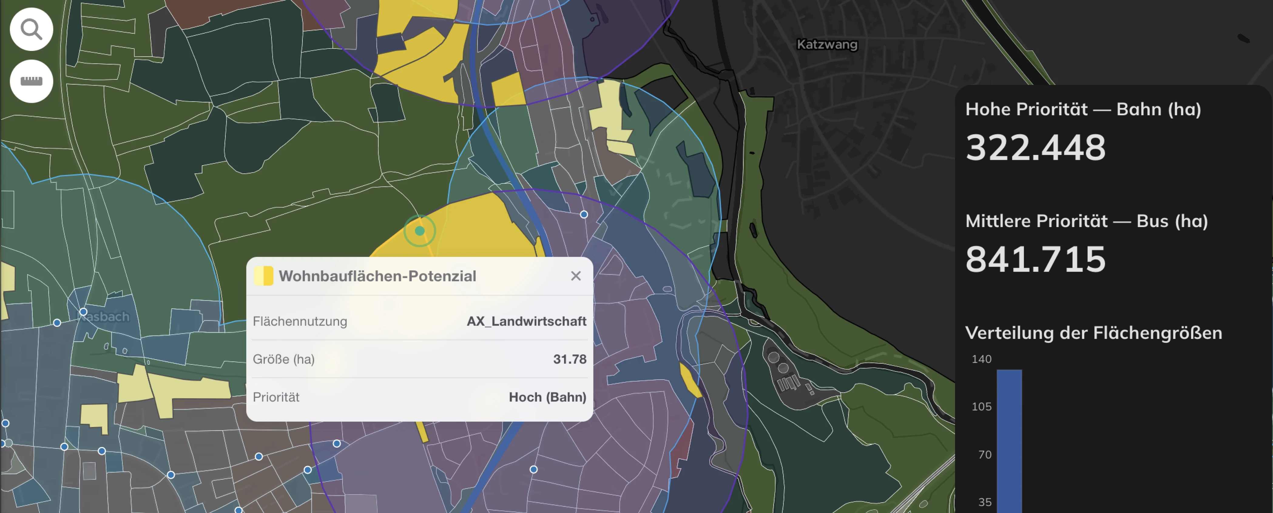
Finally, QGIS becomes our canvas for designing clear, informative maps that communicate our findings effectively. We recognized that maintaining a consistent visual identity across projects was a challenge, especially when working as a team. Our solution was to build two custom plugins that automate and standardize this final phase. The first, a style application plugin, lets a user apply a predefined visual preset to any layer in just three clicks—selecting the layer, choosing the style, and applying it. This ensures that every project adheres to our design standards effortlessly. The second, a layout template plugin, allows us to generate entire map compositions with a single click. Selecting a template (e.g., "catchment area analysis") instantly adds a print layout to QGIS, complete with predefined map extents, a standardized legend, an automated scalebar, and title blocks.

By automating these previously manual tasks, we've significantly accelerated our final map production, reduced errors, and freed up more time for the actual planning insights, ensuring every map we deliver is both beautiful and consistently on-brand.
While QGIS is powerful, we’ve faced—and still encounter—key challenges. Some we've solved, others we're still tackling:


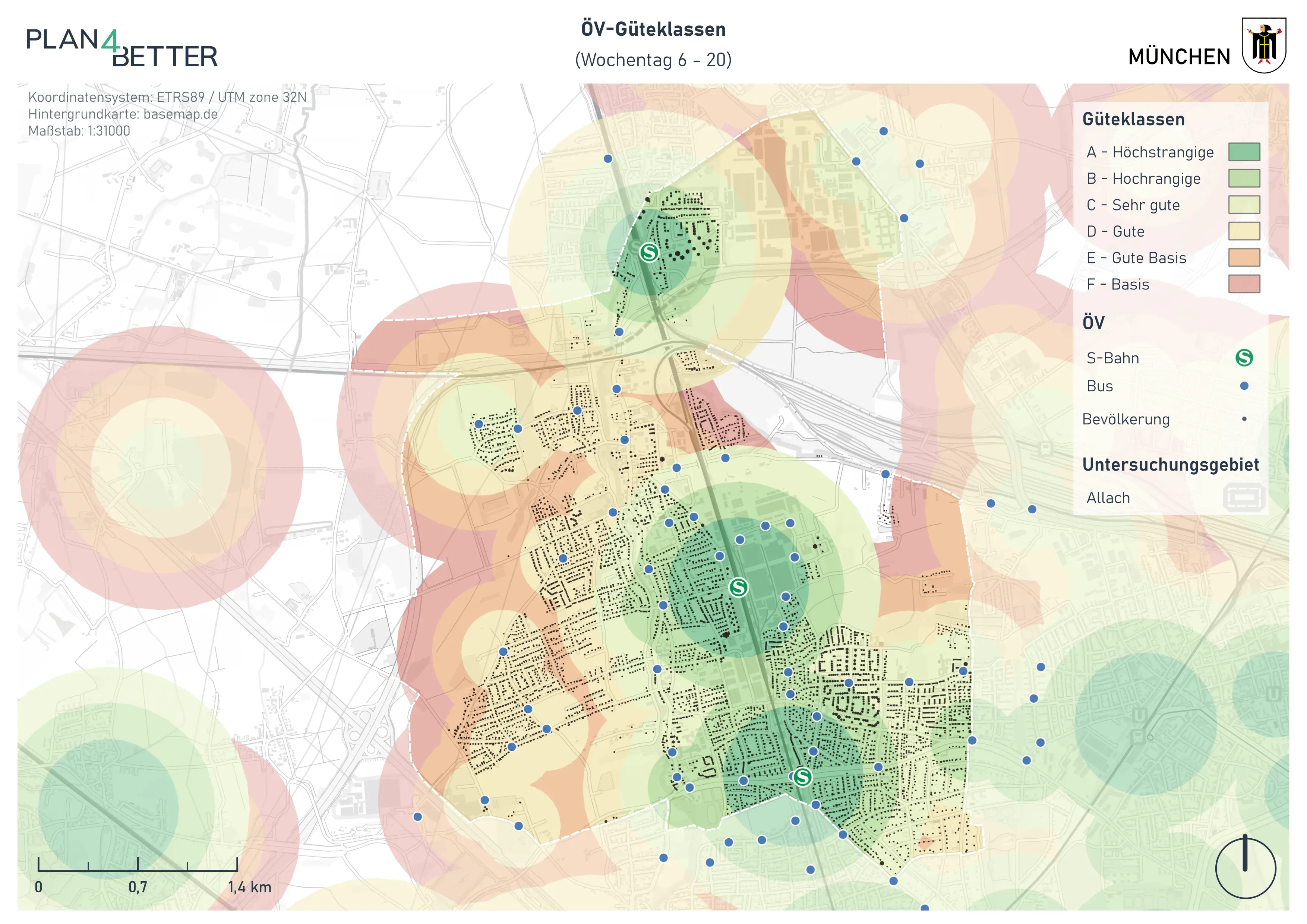
Our projects vary across public transport and active mobility planning to energy system analysis. We've worked on the calculation of public transport quality in Schleswig-Holstein, the creation of an Energy District Concept for Altrip, and the Active Mobility Concept for Allach-Untermenzing (Munich), among other projects.
We hope this was an interesting behind the scenes and gave you a clear picture of how P4B combines QGIS with our tools to create a seamless data analysis and visualization workflow. The beauty of this workflow lies in its flexibility. While QGIS provides the foundational mapping capabilities, our custom plugins and PostGIS integration allow us to tackle complex planning challenges with precision. Let us know if we can help optimize your data analysis and visualization workflow, we'd love to hear about your projects and how we might be able to support them.
If you're curious about how we've applied these and other techniques, check out our References section or follow along with our LinkedIn posts. And if you have questions about how we might work together, don't hesitate to reach out.
GOAT
.png)
Development

.jpg)
.jpg)
Join planners and cities already using GOAT to make better decisions, faster.