Energy
Mobility Planning
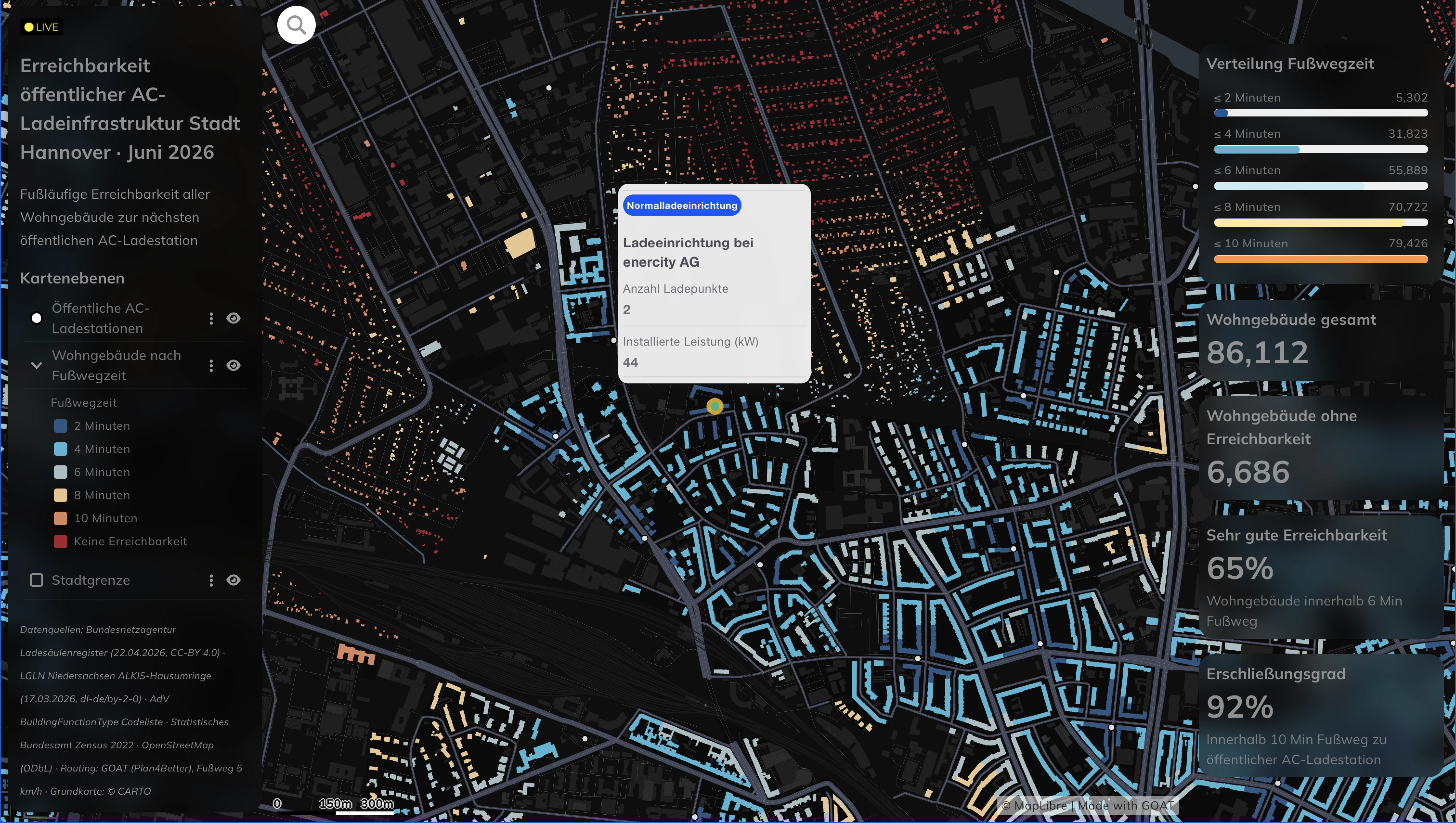
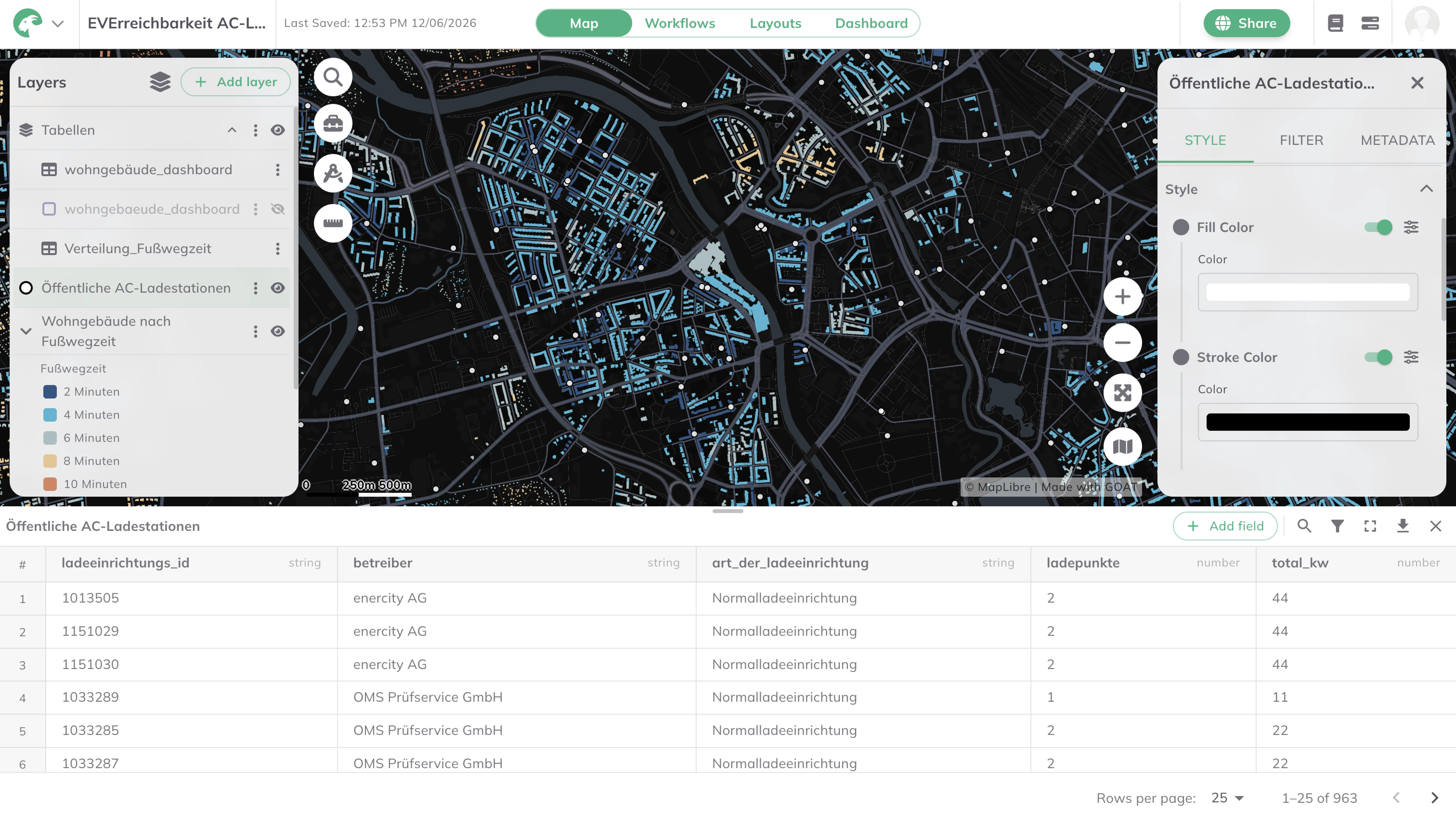
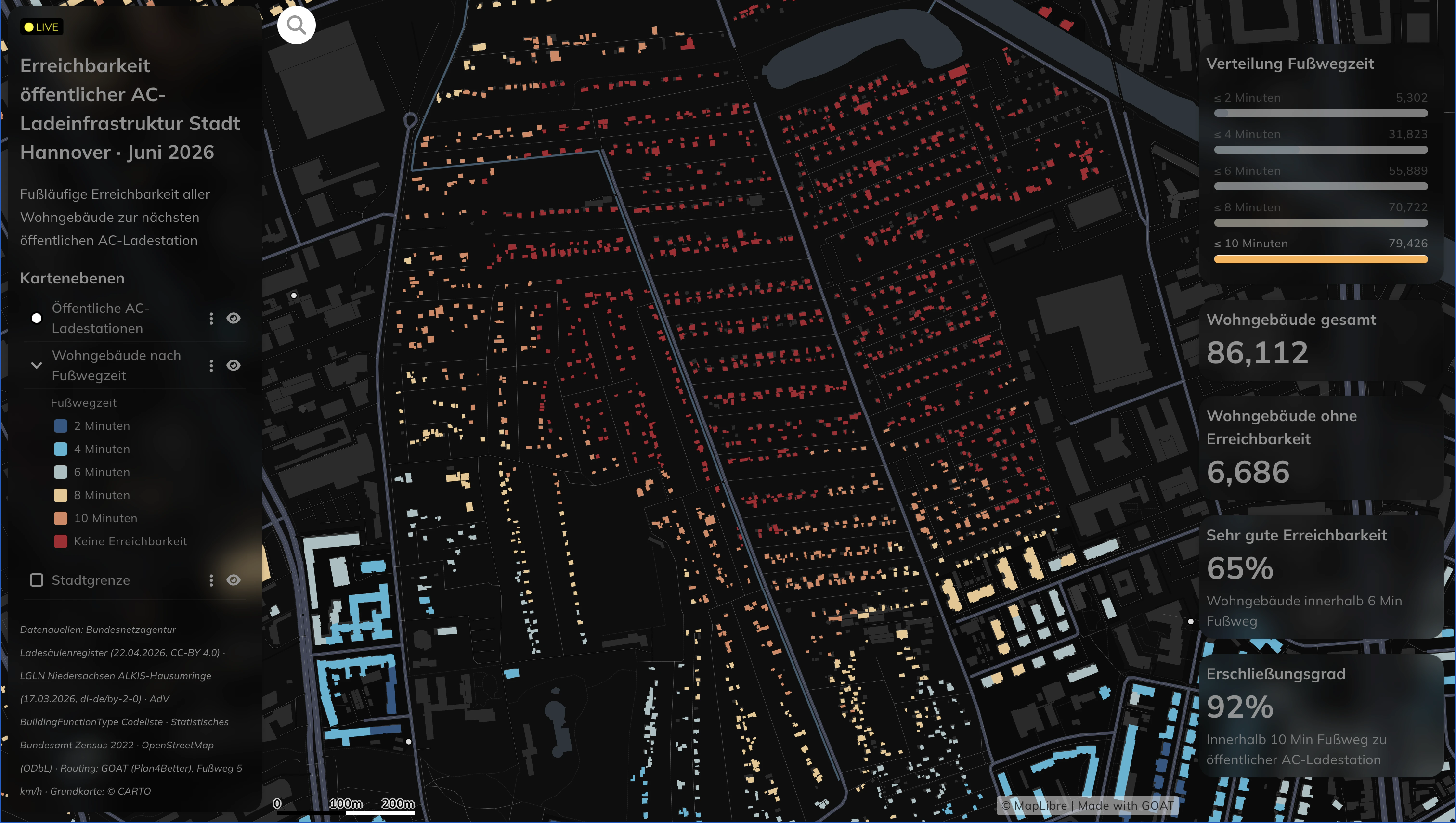
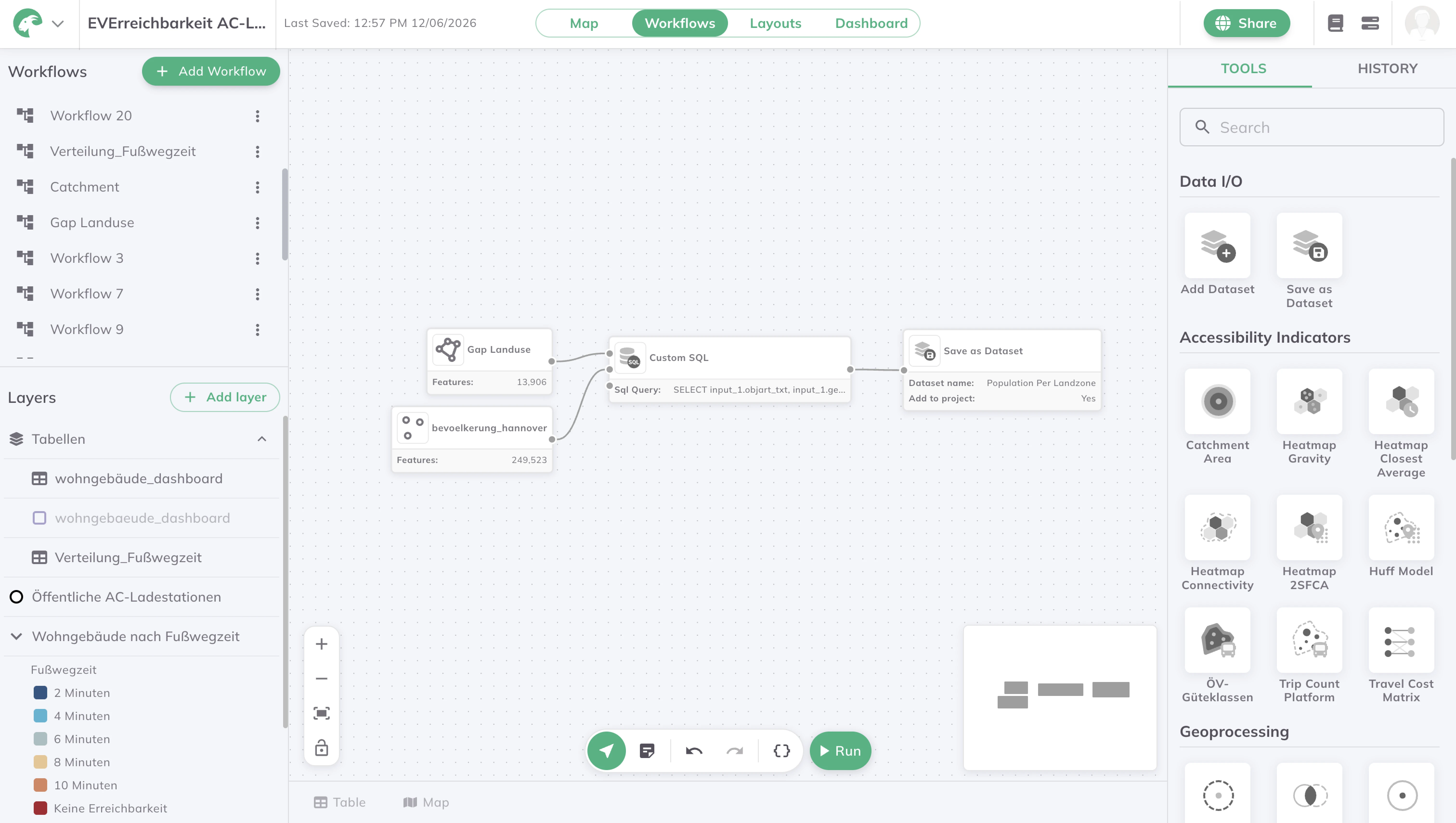
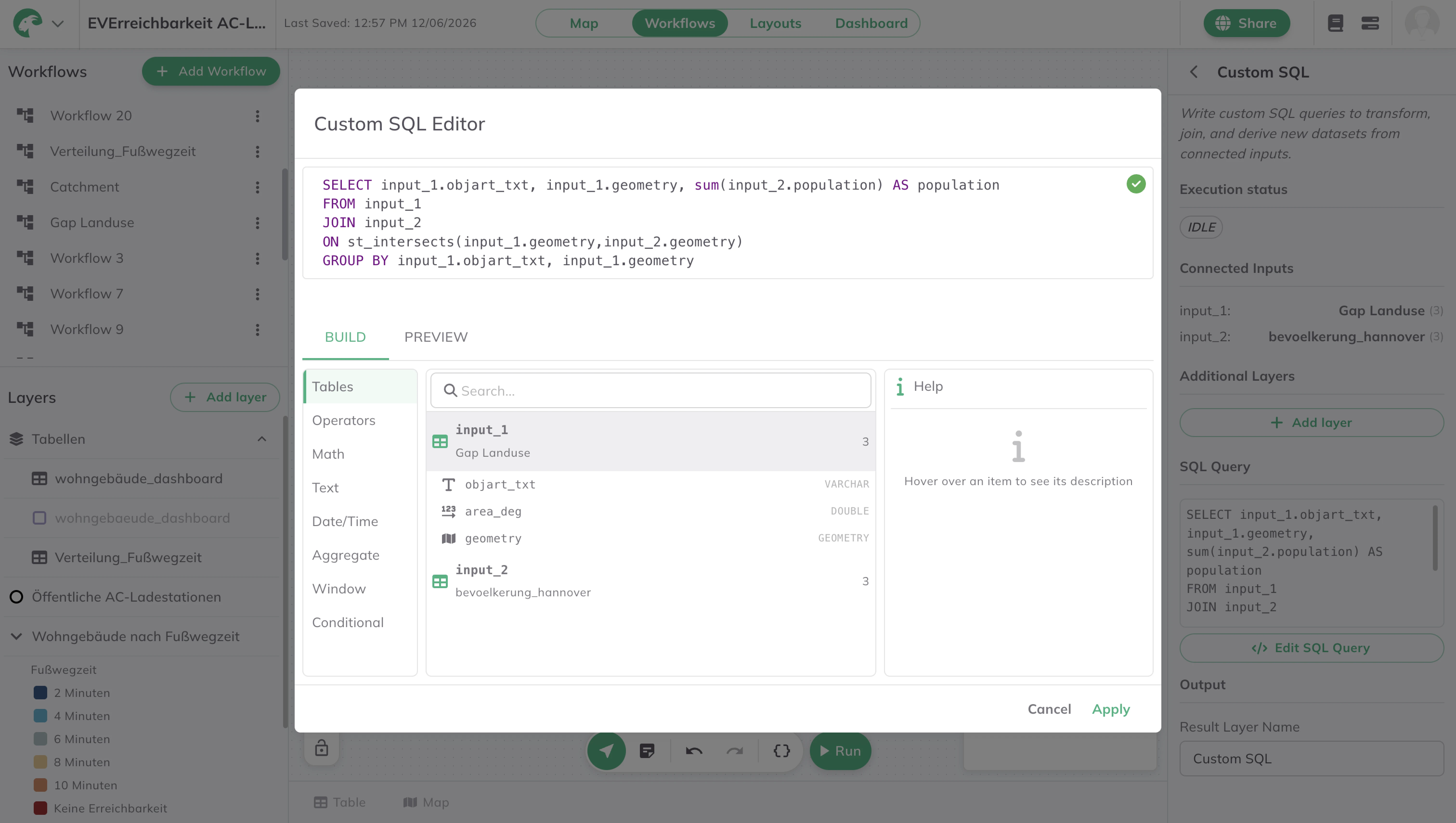
Most accessibility maps are a snapshot — accurate the day they're made, stale a month later. Charging infrastructure changes too fast for that. This dashboard takes a different approach: it measures the walking distance from every residential building in Hannover to the nearest public AC charging station, and keeps that calculation live. Custom SQL queries define the analysis, workflows to re-run whenever the underlying charging data changes, and the map updates itself — no manual rebuild, no exported snapshot going out of date. It shows what GOAT looks like as a data pipeline rather than a one-off study: the analysis is written once, automated, and connected to live data, so the picture of who can reach a charger is always current. The same automated setup transfers to any indicator a city needs to monitor over time.

.jpg)
.jpg)
Join planners and cities already using GOAT to make better decisions, faster.